2 simple columns with bootstrap
I have a simple question about bootstrap. Maybe I lack a little insight to understand the case. I even have some mastery over, but following these images:
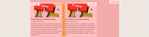
I know it's a simple question, I know how to solve it with css normally, but I want to know how best to do this with the advent of bootstrap in mind. As this structure will be repeated in several parts I can not leave the css much far-fetched... so: what is the best way to do this using bootstrap?
1 answers
In Bootstrap 4 and 3 as well, vc can use offset to fit the div in the center of cointainer.
Bootstrap 4
Notice that it was enough to put offset-2 in the first div and it worked. (see that with this I have 2 + 4 + 4 + 2, vc tb could do 3+3+3+3 putting col-3 offset-3 in the first div, just remember that at most it can add up to 12 ok) here is the official documentation on the offset, will help you understand the concept. https://getbootstrap.com/docs/4.0/layout/grid/#offsetting-columns
    <link rel="stylesheet" type="text/css" media="screen" href="https://maxcdn.bootstrapcdn.com/bootstrap/4.0.0-beta.2/css/bootstrap.min.css"/>
    <link rel="stylesheet" type="text/css" media="screen" href="https://maxcdn.bootstrapcdn.com/font-awesome/4.7.0/css/font-awesome.min.css" />
<style>
div[class^="col-"] {
    height: 50px;
    box-sizing: border-box;
    border: 1px solid;
}

</style>
</head>
<body>

<div class="container">
    <div class="row">
        <div class="col-4 offset-2">Col 1</div>
        <div class="col-4">Col 2</div>
    </div>
</div>
Bootstrap 3
In this example I did with two columns of 3 and 3 of offset
<!DOCTYPE html>
<html lang="en">

<head>
    <meta charset="utf-8" />
    <meta http-equiv="X-UA-Compatible" content="IE=edge">
    <title>Page Title</title>
    <meta name="viewport" content="width=device-width, initial-scale=1">
    <link rel="stylesheet" type="text/css" media="screen" href="https://maxcdn.bootstrapcdn.com/bootstrap/3.3.7/css/bootstrap.min.css"
    />
    <link rel="stylesheet" type="text/css" media="screen" href="https://maxcdn.bootstrapcdn.com/bootstrap/3.3.7/css/bootstrap-theme.min.css"
    />
    <link rel="stylesheet" type="text/css" media="screen" href="https://maxcdn.bootstrapcdn.com/font-awesome/4.7.0/css/font-awesome.min.css"
    />
    <style>
        div[class^="col-"] {
            height: 50px;
            box-sizing: border-box;
            border: 1px solid;
        }
    </style>
</head>

<body>

    <div class="container">
        <div class="row">
            <div class="col-xs-3 col-xs-offset-3">.col-md-3 .col-md-offset-3</div>
            <div class="col-xs-3">.col-md-3</div>
        </div>
    </div>

    <script src="https://code.jquery.com/jquery-3.2.1.min.js"></script>
    <script src="https://maxcdn.bootstrapcdn.com/bootstrap/3.3.7/js/bootstrap.min.js"></script>
</body>

</html>