Bootstrap - col-xs-X grid system does not recognize width
I am studying bootstrap, and when formulating the GRID system the col recognizes the values LG, MD, SM, but does not recognize the requested XS. When I resize the browser to mobile size it always puts the requested div at size 12 (full).
<!DOCTYPE html>
<html>
<head>
    <title>Bootstrap Bill Turner</title>
    <meta name="viewport" content="width=device-width, initial-scale=1.0">
    <link href="css/bootstrap.min.css" rel="stylesheet" media="screen">
    <link href="css/estilo.css" rel="stylesheet" media="screen">
</head>
<style>
    .c{
        background-color:aquamarine;
        border-right:1px solid black;
    }
</style>
<body>
    <div class="container">

        <div class="row">
            <div class="c col-lg-12 col-md-12 col-sm-6 col-xs-1">
                esp
            </div>
            <div class="c col-lg-12 col-md-12 col-sm-6 col-xs-1">
                esp
            </div>
            <div class="c col-lg-12 col-md-12 col-sm-6 col-xs-1">
                esp
            </div>
            <div class="c col-lg-12 col-md-12 col-sm-6 col-xs-1">
                esp
            </div>

        </div>

    </div>
    <script src="js/jquery-3.2.1.min.js"></script>
    <script src="js/bootstrap.min.js"></script>
    <script src="js/main.js"></script>
</body>
When resizing to mobile, it displays the following layout:
Browser resized for mobile resolution
Someone to give me a light on what I'm doing from wrong?
A print with the complete code, and the three visualization forms: 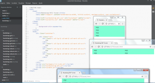 complete code and 3 visualization forms as you can see, all right, except in col XS. (I did not print the LG because I did not have space in the same print)
3 answers
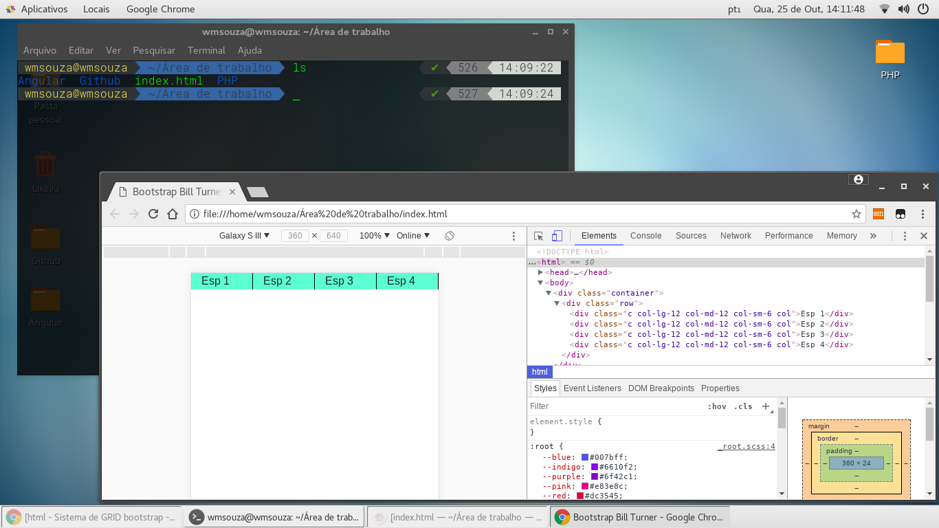
Reading the documentation you will see that there has been a change, it has become more simplified instead of col-xs-N now you can only col or col-N, See below:
In this example, we create 4 columns reporting in the attribute class the value col, See they are in the same row because the value was divided among themselves.
<!DOCTYPE html>
<html>
    <head>
        <meta charset="utf-8">
         <meta name="viewport" content="width=device-width, initial-scale=1, shrink-to-fit=no">
        <link rel="stylesheet" href="https://maxcdn.bootstrapcdn.com/bootstrap/4.0.0-beta.2/css/bootstrap.min.css" />
        <style>
            .c{
                background-color:aquamarine;
                border-right:1px solid black;
            }
        </style>
    </head>
    <body>
    <div class="container">
        <div class="row">
            <div class="c col-lg-12 col-md-12 col-sm-6 col">Esp 1</div>
            <div class="c col-lg-12 col-md-12 col-sm-6 col">Esp 2</div>
            <div class="c col-lg-12 col-md-12 col-sm-6 col">Esp 3</div>
            <div class="c col-lg-12 col-md-12 col-sm-6 col">Esp 4</div>
        </div>
    </div>
        <!-- jQuery first, then Popper.js, then Bootstrap JS -->
    <script src="https://code.jquery.com/jquery-3.2.1.slim.min.js" integrity="sha384-KJ3o2DKtIkvYIK3UENzmM7KCkRr/rE9/Qpg6aAZGJwFDMVNA/GpGFF93hXpG5KkN" crossorigin="anonymous"></script>
    <script src="https://cdnjs.cloudflare.com/ajax/libs/popper.js/1.12.3/umd/popper.min.js" integrity="sha384-vFJXuSJphROIrBnz7yo7oB41mKfc8JzQZiCq4NCceLEaO4IHwicKwpJf9c9IpFgh" crossorigin="anonymous"></script>
    <script src="https://maxcdn.bootstrapcdn.com/bootstrap/4.0.0-beta.2/js/bootstrap.min.js" integrity="sha384-alpBpkh1PFOepccYVYDB4do5UnbKysX5WZXm3XxPqe5iKTfUKjNkCk9SaVuEZflJ" crossorigin="anonymous"></script>
    </body>
</html>
For some reason Snippet does not work here in SOpt but I put the Print and can test that it works.
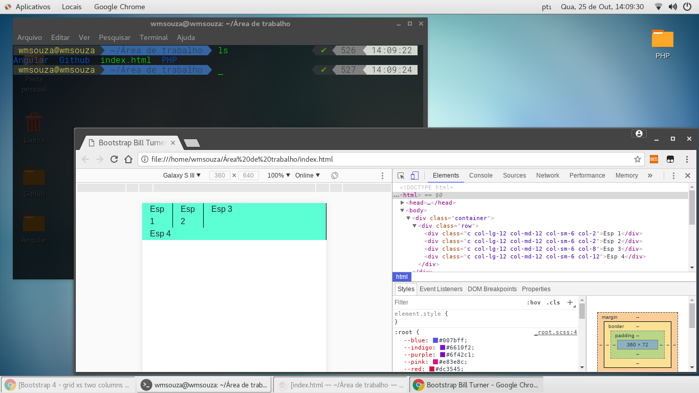
In this other example we give a value N for col
<!DOCTYPE html>
<html>
    <head>
        <meta charset="utf-8">
         <meta name="viewport" content="width=device-width, initial-scale=1, shrink-to-fit=no">
        <link rel="stylesheet" href="https://maxcdn.bootstrapcdn.com/bootstrap/4.0.0-beta.2/css/bootstrap.min.css" />
        <style>
            .c{
                background-color:aquamarine;
                border-right:1px solid black;
            }
        </style>
    </head>
    <body>
    <div class="container">
        <div class="row">
            <div class="c col-lg-12 col-md-12 col-sm-6 col-2">Esp 1</div>
            <div class="c col-lg-12 col-md-12 col-sm-6 col-2">Esp 2</div>
            <div class="c col-lg-12 col-md-12 col-sm-6 col-8">Esp 3</div>
            <div class="c col-lg-12 col-md-12 col-sm-6 col-12">Esp 4</div>
        </div>
    </div>
        <!-- jQuery first, then Popper.js, then Bootstrap JS -->
    <script src="https://code.jquery.com/jquery-3.2.1.slim.min.js" integrity="sha384-KJ3o2DKtIkvYIK3UENzmM7KCkRr/rE9/Qpg6aAZGJwFDMVNA/GpGFF93hXpG5KkN" crossorigin="anonymous"></script>
    <script src="https://cdnjs.cloudflare.com/ajax/libs/popper.js/1.12.3/umd/popper.min.js" integrity="sha384-vFJXuSJphROIrBnz7yo7oB41mKfc8JzQZiCq4NCceLEaO4IHwicKwpJf9c9IpFgh" crossorigin="anonymous"></script>
    <script src="https://maxcdn.bootstrapcdn.com/bootstrap/4.0.0-beta.2/js/bootstrap.min.js" integrity="sha384-alpBpkh1PFOepccYVYDB4do5UnbKysX5WZXm3XxPqe5iKTfUKjNkCk9SaVuEZflJ" crossorigin="anonymous"></script>
    </body>
</html>For some reason the Snippet does not work here in the SOpt but I put the Print and can test that it works.
Reference
Hello, the way this one should work. See your code running. https://codepen.io/mjunior/pen/zEQPpb?editors=1100
You may not have specified the viewport metatag in your html.
<meta name="viewport" content="width=device-width, initial-scale=1, maximum-scale=1, user-scalable=no">
You have to watch out for this resizing, in the sense that you are even resizing for mobile, because you may be resizing for tablet, where the tablet uses the sm class.
Moreover, it has a Class ' c ' before the measurements. Is that correct? Do you really have this class (capitalized)?
<div class="C col-lg-12 col-md-12 col-sm-6 col-xs-1">
 esp
</div>