Create responsive image carousel in Bootstrap [closed]
want to improve this question? Update the question so it's on-topic for Stack Overflow.
Closed 1 year ago .
improve this questionI'm trying to create a carousel of images with bootstrap and would like it to be responsive. I have already managed to be part of this carousel, but I do not understand the question of the size of the image.
Follows below my code:
<div id="meuSlider" class="carousel slide" data-ride="carousel">
    <ol class="carousel-indicators">
        <li data-target="#meuSlider" data-slide-to="0" class="active"></li>
        <li data-target="#meuSlider" data-slide-to="1"></li>
        <li data-target="#meuSlider" data-slide-to="2"></li>
    </ol>
    <div class="carousel-inner">
        <div class="item active"><img src="img/c1.jpg" alt="Slider 1" /></div>
        <div class="item"><img src="img/c2.jpg" alt ="Slide 2" /></div>
        <div class="item"><img src="img/c3.jpg" alt="Slide 3" /></div>
    </div>
    <a class="left carousel-control" href="#meuSlider" data-slide="prev"><span class="glyphicon glyphicon-chevron-left"></span></a>
    <a class="right carousel-control" href="#meuSlider" data-slide="next"><span class="glyphicon glyphicon-chevron-right"></span></a>
</div>
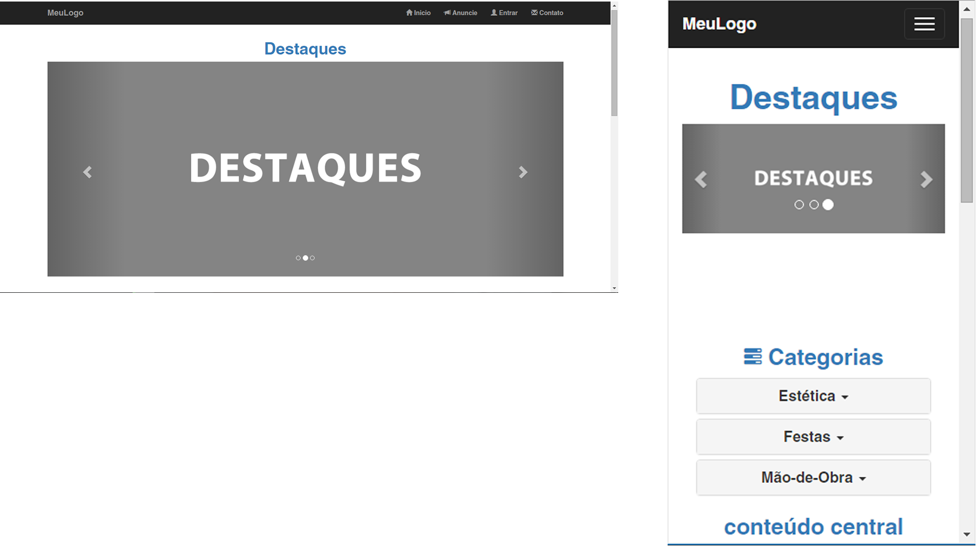
When I put images with height of 500px the problem is that it occupies a good part of the screen in browsers with the maximized window, but when I decrease the size of the window it gets excellent size;
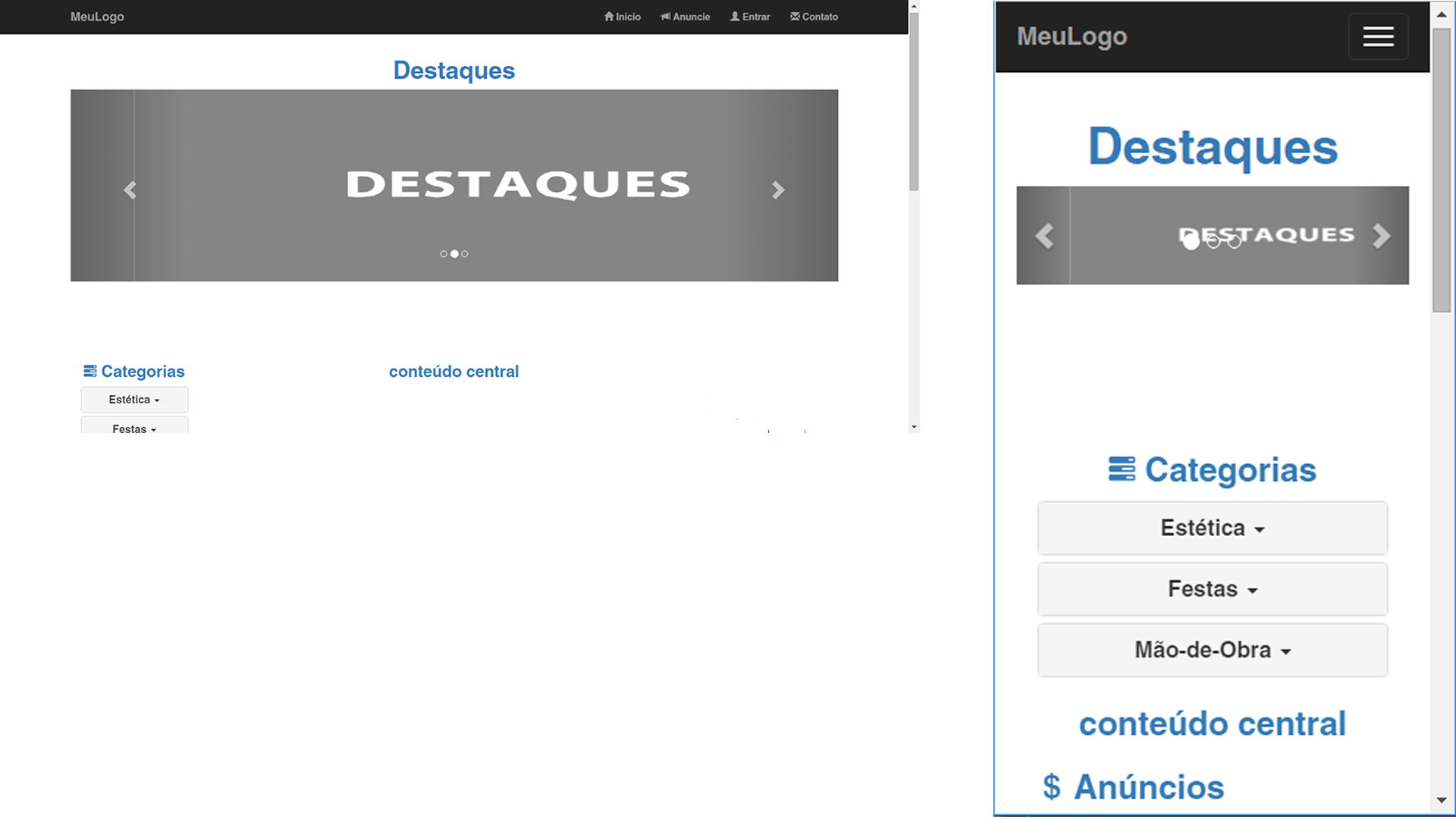
But I would like to put images with height of 200px, only the problem is when I decrease the size of the window the height of the image becomes very small.
How to do for the height of the image to be the size I want on smaller screens?
2 answers
Set a minimum height for the image in CSS.
.carousel-inner img {
    min-height: 200px;
}
Directly change the class by resizing the pixels... Probably so you can solve.
@media(max-width:767px) {
        .carousel-inner>.item>a>img, .carousel-inner>.item>img{
            width: 100%;
            height: 240px;
    }

@media(max-width:450px) {
        .carousel-inner>.item>a>img, .carousel-inner>.item>img{
            width: 100%;
            height: 269px;
}

@media(max-width:320px) {
        .carousel-inner>.item>a>img, .carousel-inner>.item>img{
            width: 100%;
            height: 240px;
}