Difference in main component analysis (PCA) graphs)
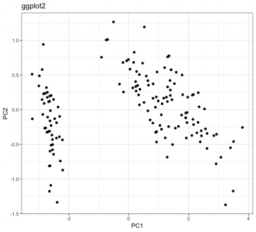
Today I was analyzing a dataset and noticed something I had never noticed before. In order to visualize a multivariate dataset, I created its PCA and projected the observations on the two main components. For this, I used the packages ggplot2 and ggfortify. I will reproduce the results with another dataset, which is not the one I am analyzing, but the same phenomenon occurs. The results are below:
library(ggplot2)
library(ggfortify)

iris.pca <- prcomp(iris[, -5])
ggplot(iris.pca$x, aes(x = PC1, y = PC2)) +
  geom_point()
autoplot(iris.pca)
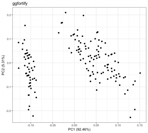
Notice that qualitatively I have the same result on both charts. The difference between them arises on the scale: while the main component 1 (PC1) of the graph called ggplot2 varies between approximately -3 and 4, this same PC1 in the graph called ggfortify varies between approximately -0.125 and 0.15. Similar behaviors occur in the other main components.
I know that the ggplot2 is not wrong, since when calculating the statistics of iris.pca$x, I get values that beat with what the graph shows:
summary(iris.pca$x)
      PC1               PC2                PC3                PC4
 Min.   :-3.2238   Min.   :-1.37417   Min.   :-0.76017   Min.   :-0.5054344
 1st Qu.:-2.5303   1st Qu.:-0.32492   1st Qu.:-0.17582   1st Qu.:-0.0778999
 Median : 0.5546   Median : 0.02216   Median :-0.01639   Median : 0.0007274
 Mean   : 0.0000   Mean   : 0.00000   Mean   : 0.00000   Mean   : 0.0000000
 3rd Qu.: 1.5501   3rd Qu.: 0.32542   3rd Qu.: 0.20550   3rd Qu.: 0.0896801
 Max.   : 3.7956   Max.   : 1.26597   Max.   : 0.69415   Max.   : 0.5053050
So what is happening with the function autoplot? What transformation is it applying to my data to leave it with this reduced amplitude? And why does she do that?
1 answers
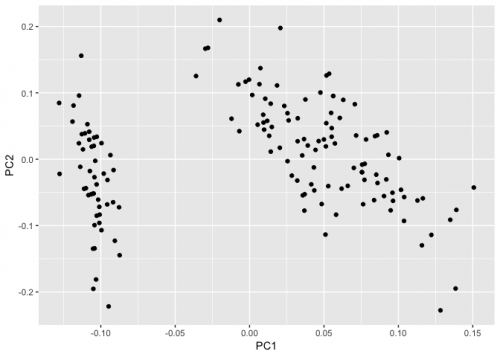
The autoplot function of ggfortify does a kind of standardization. More specifically it does the following:
library(ggplot2)
library(ggfortify)

iris.pca <- prcomp(iris[, -5])

x <- apply(iris.pca$x, 2, function(x) x/(sd(x)*sqrt(nrow(iris))))

ggplot(x, aes(x = PC1, y = PC2)) +
  geom_point()
Created on 2019-03-15 by the reprex package (v0.2.1)
There are several different ways to standardize the results of the main components as shown by this answer and other links it cites. Each with a different motive.
In my view the author of autoplot just chose a standardization for function output for several R packages that also do core component analysis and use different methodologies to standardize the results.