Error coloring bar chart and caption with pal function.bands
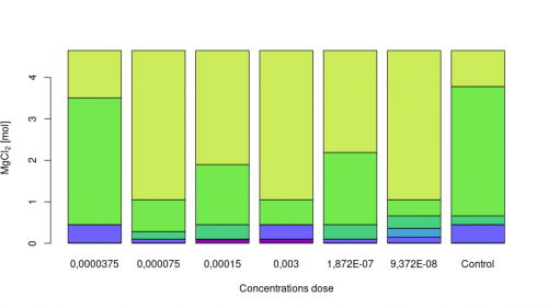
I am trying to reproduce the chart below:
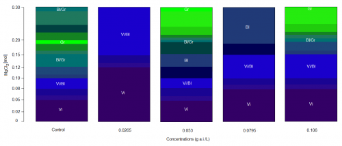
However, I am not being able to color my chart through the pal function.bands according to the information in the spreadsheet below:
The data can be found at this link: database
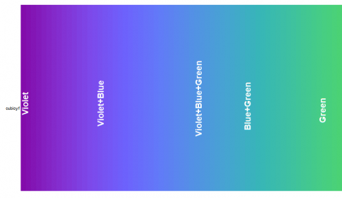
The colors in which I am representing in the table above are defined below by and can be seen in the pals package:
I need every color to be associated the information that is in the sheet above, and each of the colors with their respective acronyms inside the graph, for example:
The acronyms are:
Control 0.00 Violet
Control 0.01 Violet
Control 0.02 Violet
.
.
.
Control 0.30 Green


Violet = Vi
Violet + Blue = Vi / Bl
Blue + Green = Bl / Gr
Green = Gr
Violet + Blue + Green = Vi / Bl / Gr
Below are the codes in R, however, I am not being able to color through the pal function.bands and even insert the caption Inside the chart:
library(RColorBrewer)
library(pals)

pal.bands(cubicyf)

dados = read.table("datagraph.csv", header=T, dec=",",sep=";")
dados$Group=as.factor(dados$Group)
dados$Colors=as.factor(dados$Colors)
x <- xtabs(~Concentration + Group, data = dados)
x
x11()
barplot(x,
        beside = FALSE,
        xlab = "Concentrations dose",
        ylab = "Concentrations mol",
        col = "pal.bands(cubicyf)")
legend("Vi", "Vi/Bl","Vi/Bl/Gr","Gr/Bl","Gr")

Error in rect(y1, x1, y2, x2, ...) :
  invalid color name 'pal.bands(cubicyf)'
> legend("Vi", "Vi/Bl","Vi/Bl/Gr","Gr/Bl","Gr")
Error in match.arg(x, c("bottomright", "bottom", "bottomleft", "left",  :
  'arg' should be one of “bottomright”, “bottom”, “bottomleft”, “left”, “topleft”, “top”, “topright”, “right”, “center”
1 answers
First, load the necessary packages and read the data but this time I will read with read.csv2, since it already has the values of header = TRUE, dec = "," and sep = ";".
library(RColorBrewer)
library(pals)

dados <- read.csv2("datagraph.csv")
dados$Group <- factor(dados$Group)
dados$Colors <- factor(dados$Colors)
Now see how the colors are sorted.
levels(dados$Colors)
#[1] "Blue"              "Blue+Green"        "Green"
#[4] "Violet"            "Violet+Blue"       "Violet+Blue+Green"
This is not the order required, it is intended to have the violets first and the greens at the end. The correct order will be:
levels(dados$Colors)[c(4:6, 1:3)]
#[1] "Violet"            "Violet+Blue"       "Violet+Blue+Green"
#[4] "Blue"              "Blue+Green"        "Green"
Just redo factor.
dados$Colors <- factor(dados$Colors,
                       levels = levels(dados$Colors)[c(4:6, 1:3)])
Now, instead of xtabs, I'm going to create a date.frame of values of aggregated concentrations by group and color.
agg <- aggregate(Concentration ~ Group + Colors, data = dados, sum)
And finally the graph.
n <- length(levels(agg$Colors))
clrs <- cubicyf(n)

barplot(Concentration ~ Colors + Group,
        data = agg,
        beside = FALSE,
        xlab = "Concentrations dose",
        ylab = expression(MgCl[2] ~ "[mol]"),
        col = clrs)