FlexBox + CSS GRID
Guys I would like to know if there is any possibility to use CSSGrid with FlexBox.
display:grid;
display:flex;
I speak to use both in the same project, if not, which one would I recommend to use? You can give an example of how to use the two together if you want.
1 answers
Yes my friend is perfectly feasible to use display:grid and display:flex in the same project. Mainly for the particularities of each. Roughly speaking the Grid vc can use more to assemble the page layout structure and the flex to build the "components" within these grid layout blocks.
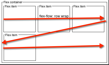
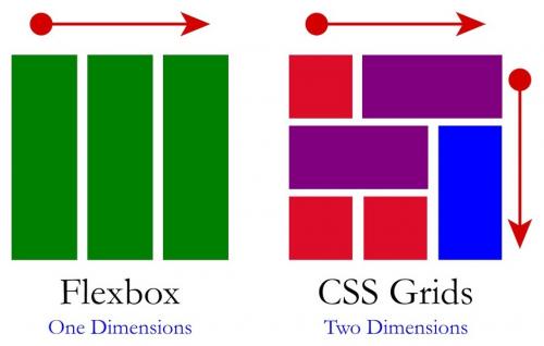
Grid takes advantage when it comes to building page layouts, as it offers the possibility to work by expanding the spaces vertically and horizontally. Already the flex-box only occupies the spaces on the axis X (although with" little ways " you can get around this, but it is not the option indicated, especially having the grid available)
To better understand see these two image. In Flex the components follow only one axis, either X or Y, and in Grid the two are available at the same time!
Now I will give you some practical examples. I'll ride the same structure with Flex and then with Grid, notice how with Flex more lines of code are needed and the structure becomes less semantic.
Example with FLEX
* {
  padding: 0;
  margin: 0;
  box-sizing: border-box;
}
html, body {
  width: 100%;
  height: 100%;
  margin: 0;
  padding: 0;
}
section, header, aside, main, article, footer {
  border: 1px solid;
  min-height: 80px;
}
section {
  display: flex;
  flex-wrap: wrap;
}
header, footer {
  width: 100%;
}
aside {
  width: 30%;
}
main {
  width: 70%;
  display: flex;
  flex-direction: column;
  border: 1px solid red;
}
article {
  width: 100%;
}
<section>
<header>header</header>
<aside>aside</aside>
<main>
<article>artivle</article>
<article>article</article>
</main>
<footer>footer</footer>
</section>Already with Grid we have much less code, a more semantic structure and easier to work the responsiveness of each container if you want.
Example with GRID
* {
  padding: 0;
  margin: 0;
  box-sizing: border-box;
}
html, body {
  width: 100%;
  height: 100%;
  margin: 0;
  padding: 0;
}
body {
	display: grid;
	grid-template-areas:
    "header header "
    "aside main"
    "footer footer ";
	grid-template-rows: 1fr 4fr 1fr;
	grid-template-columns: 1fr 2fr;
}
header, aside, main, article, footer {
  border: 1px solid;
  min-height: 30px;
}
header {
  grid-area: header;
}
aside {
	grid-area: aside;
}
main {
	grid-area: main;
  display: grid;
  border: 1px solid red;
}
footer {
  grid-area: footer;
}
<header>header</header>
<aside>aside</aside>
<main>
<article>artivle</article>
<article>article</article>
</main>
<footer>footer</footer>OBS1: despite me having assembled the models they could work perfectly together, for example, the <main> can be display:flex without any problem.
OBS2: I did not do the responsive treatment in these examples, they are just didactic models ok
Although Grid practically accepts all the attributes and styles of Flex there are some particularities. And for me the most annoying of them is with regard to the centralization of elements in the grid-template-columns pro example. When you go playing the elements for the bottom line vc can not Center the last element, this happens due to the grid structure.
See image and code example:
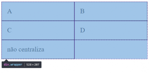
.wrapper {
    display: grid;
    grid-template-columns: repeat(auto-fill, minmax(200px, 1fr) );
    justify-content: center; /* não vai funcionar o alinhamento center*/
}
.box {
    border:1px solid;
    padding: 20px;
    font-size: 150%;
}
<div class="wrapper">
<div class="box a">A</div>
<div class="box b">B</div>
<div class="box c">C</div>
<div class="box d">D</div>
<div class="box e">não centraliza</div>
</div>The same example with Flex with the option to center the last item:
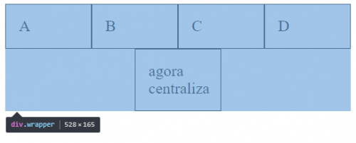
.wrapper {
    display: flex;
    flex-wrap: wrap;
    justify-content: center;
}
.box {
    width: 25%;
    box-sizing: border-box;
    border:1px solid;
    padding: 20px;
    font-size: 100%;

}
<div class="wrapper">
<div class="box a">A</div>
<div class="box b">B</div>
<div class="box c">C</div>
<div class="box d">D</div>
<div class="box e">agora centraliza</div>
</div>Tips:
Always take into account browser support, and its target audience uses or does not use a browser that supports these display types
Https://caniuse.com/#search=flex
Https://caniuse.com/#search=grid
And read the official documentation, this is from Mozilla, but it is quite complete and didactics:
Https://developer.mozilla.org/pt-BR/docs/Web/CSS/CSS_Grid_Layout/Basic_Concepts_of_Grid_Layout