How can I make a "spin" animation in CSS using the border of a div?
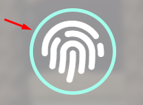
The animation I basically want is when I hover in the fingerprint div the border is in loading for 3 seconds (a progressbar type animation, starting from 0 and reaching the end of the circle).
2 answers
You can use spans along with the fingerprint icon. Then just work with a keyframes to make the animation rotating two spans in sequence: the right one starts the animation immediately completing the circle to half, while the left one starts after 1.5 seconds when the right one started, and the two animations last 1.5 seconds, totaling 3 seconds of animation.
The Duration Time is adjustable, just change the values:
 // PRIMEIRA ANIMAÇÃO
.fingerprint:hover .progress-right .progress-bar{
   animation: loading 1.5s linear forwards;
                       ↑
                    duração
}

// SEGUNDA ANIMAÇÃO
.progress:hover .progress-left .progress-bar{
   animation: loading 1.5s linear forwards 1.5s;
                       ↑                    ↑
                    duração           tempo de atraso
}
If you want to make size adjustments, you don't mess with anything except the properties width and height of the elements and the font-size of the icon.
See working (hover over the icon):
.progress *{
box-sizing: border-box;
}
.progress{
width: 130px;
height: 130px;
position: absolute;
top: 0;
left: 0;
}
.progress > span{
width: 50%;
height: 100%;
overflow: hidden;
position: absolute;
top: 0;
}
.progress .progress-bar{
width: 100%;
height: 100%;
border: 5px solid transparent;
position: absolute;
top: 0;
}
.progress .progress-left .progress-bar{
left: 100%;
border-top-right-radius: 80px;
border-bottom-right-radius: 80px;
border-left: 0;
-webkit-transform-origin: center left;
transform-origin: center left;
}
.progress .progress-right .progress-bar{
left: -100%;
border-top-left-radius: 80px;
border-bottom-left-radius: 80px;
border-right: 0;
-webkit-transform-origin: center right;
transform-origin: center right;
}
.progress .progress-right{
right: 0;
}
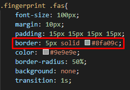
.progress .progress-bar{
border-color: #8fa09c;
}
@keyframes loading{
0%{
-webkit-transform: rotate(0deg);
transform: rotate(0deg);
}
100%{
-webkit-transform: rotate(180deg);
transform: rotate(180deg);
}
}
.fingerprint .fas{
font-size: 100px;
padding: 15px;
color: #9e9e9e;
}
.fingerprint{
display: inline-block;
width: 130px;
height: 130px;
position: relative;
margin: 10px;
}
.fingerprint:hover .progress-right .progress-bar{
animation: loading 1.5s linear forwards;
}
.progress:hover .progress-left .progress-bar{
animation: loading 1.5s linear forwards 1.5s;
}<link rel="stylesheet" href="https://use.fontawesome.com/releases/v5.7.2/css/all.css" integrity="sha384-fnmOCqbTlWIlj8LyTjo7mOUStjsKC4pOpQbqyi7RrhN7udi9RwhKkMHpvLbHG9Sr" crossorigin="anonymous">
<div class="fingerprint">
<i class="fas fa-fingerprint"></i>
<div class="progress">
<span class="progress-left">
<span class="progress-bar"></span>
</span>
<span class="progress-right">
<span class="progress-bar"></span>
</span>
</div>
</div>Here is an example. The whole point is to animate a pseudo-element in the :hover of the parent div. So you avoid running the parent directly and then the child as well. Also in the interection-count of the animation vc puts the value of 3 to spin only 3x and then stop, that is, 3 spins in 3 seconds (each spin has 1s and since it is 3 spins totals 3 seconds, I left comments in the code) . To give the appearance of spin of load just put one of the edges with the transparent color, I used border-bottom-color: transparent; to give this effect.

Follows the code in the image above.
.icon {
  display: flex;
  justify-content: center;
  align-items: center;
  position: relative;
  width: 48px;
  height: 48px;
}
.icon::after {
  content: "";
  position: absolute;
  top: 0;
  left: 0;
  width: 100%;
  height: 100%;
  box-sizing: border-box;
  border: 5px solid #000;
  border-radius: 50%;
}
.icon:hover::after {
  animation: gira 1s linear; /* 1s é o tempo da animação de cada giro */
  animation-iteration-count: 3; /* 3 é a quantidade de giros, 3 giros = 3 segundos */
}
@keyframes gira {
  0% {
    transform: rotate(0deg);
    border-bottom-color: transparent;
  }
  100% {
    border-bottom-color: transparent;
    transform: rotate(360deg);
  }
}
<div class="icon">
  <img src="https://placecage.com/24/24">
</div>