How can I use seaborn (catplot or barplot) to display the value of several charts on one chart?
How can I use seaborn (catplot or barplot) to display the value of multiple DataFrame columns on a single graph? The following is not a working code. It correctly displays the graph for only one column, and you need it to display multiple columns, as shown in the example below.
import pandas as pd
import matplotlib.pyplot as plt
import seaborn as sns

sns.set()


c1 = [0.3, 0.5, 0, 0.9]
c2 = [0.7, 0, 0.1, 0]
dct = {'c1':c1, 'c2':c2}
df = pd.DataFrame(dct)
print(df)

sns.barplot(x=df.index.values, y='c1', data=df)
#sns.barplot(x=df.index.values, y='c2', data=df)
plt.show()
Desired graph

1
Author: Yuriy Tigiev, 2020-10-04
2 answers
An approximate version. Probably, you can still somehow prettier, but I haven't come up with it yet:
df1 = df.stack().reset_index(level=1)
df1.columns = ['c', 'value']
sns.barplot(x=df1.index.values, y='value', hue='c', data=df1)
plt.show()
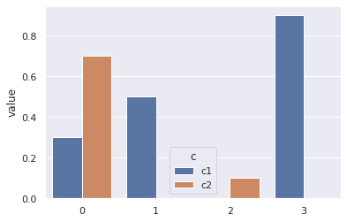
That is, you need to make such a DataFrame, so that you can divide the columns into c1 and c2 by hue. In df1, I got the following:
    c   value
0   c1  0.3
0   c2  0.7
1   c1  0.5
1   c2  0.0
2   c1  0.0
2   c2  0.1
3   c1  0.9
3   c2  0.0
1
Author: CrazyElf, 2020-10-14 16:57:12
By the way, if Seaborn is not a prerequisite, then everything is generally simple:
df.plot(kind='bar');
# или df.plot.bar();

1
Author: CrazyElf, 2020-10-14 18:06:32