How do I create circular image with CSS mascara and hover effect?
Does anyone know any css template ready for me to use as a reference to recreate an effect on my site that I am switching from wordpress to html / css I saw from the code that it is a hover layer mask that creates the effect, but I still couldn't reproduce the same using html/css.
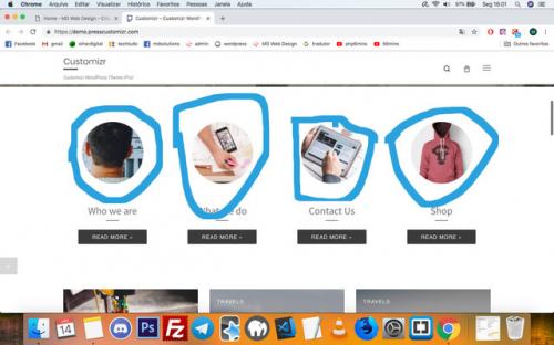
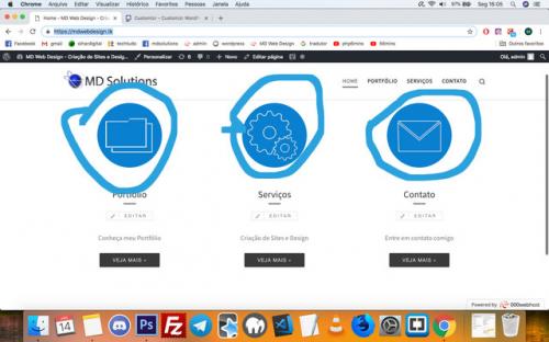
Are these icons that I circled blue I want to create an equal effect on this icons using only html / css (when the mouse hovers over the circular image the mascara decreases and increases the image size, since when the mouse is not on top of the image it appears with a larger mask that makes it appear to be smaller)
Address of the sites are:
Https://mdwebdesign.tk/
https://demo.presscustomizr.com /
The pictures are:
Https://i.ibb.co/M6SxXqN/efeitohover.jpg
/images/content/356085/7ba8952fba87043ab4ce1cef9e1e4a29.jpg
Code:
Html:
<main>
    <div class="linkshome">
        <div class="czr-link-mask">
            <a href="portfolio.html">
                <img src="img/portfolio.jpg">
                <h4>Portfólio</h4>
            </a>
        </div>
        <div class="czr-link-mask">
            <a href="servicos.html">
                <img src="img/servicos.jpg">
                <h4>Serviços</h4>
            </a>
        </div>
        <div class="czr-link-mask">
            <a href="contato.html">
                <img src="img/contato.jpg">
                <h4>Contato</h4>
            </a>
        </div>
    </div>
</main>
Css:
main {
    margin-left: 90px;
    margin-right: 60px;
    padding: 20px;

}

.linkshome {
    display: flex;
    justify-content: center;
}

.linkshome h4{
    text-align: center;
}

/*Efeito Destaques (ainda testando efeitos para portfólio,serviços e contato.jpg)*/

.czr-link-mask-p.hover .czr-link-mask::before,.expanded .czr-link-mask::before, .czr-link-mask:hover {
    -webkit-transform:translate(-50%,-50%) scale(1.4);
    transform:translate(-50%,-50%) scale(1.4);
    -webkit-transform:translate3d(-50%,-50%,0) scale(1.4);
    transform:translate3d(-50%,-50%,0) scale(1.4);
}

/*Destaques*/
1 answers
this is just one example, it may have other answers with different solutions. Basically for this there is no single answer...
The technique I used was to put the image inside a div, since it is not possible to use direct pseudo-element in the img tag. So I made the pseudo element in the div that the image will be inside.
Then in that ::after of div container from the image I used a box-shadow to make the "mask", in :hover and pass this box-shadow to zero, with this I do not need to mess with the scale of the image, and work only like this pseudo element... the detail is that the color of box-shadow has to be the same color as the background.
html,
body {
width: 100%;
height: 100%;
margin: 0;
padding: 0;
}
main {
margin-left: 90px;
margin-right: 60px;
padding: 20px;
}
.linkshome {
display: flex;
justify-content: center;
}
.linkshome h4 {
text-align: center;
}
/*Efeito Destaques (ainda testando efeitos para portfolio,serviços e contato.jpg)*/
.czr-link-mask {
margin: 2rem;
}
.czr-link-mask .box {
width: 200px;
height: 200px;
border-radius: 50%;
position: relative;
}
.czr-link-mask .box::after {
content: "";
position: absolute;
top: 0;
left: 0;
width: 200px;
height: 200px;
overflow: hidden;
border-radius: 50%;
box-shadow: inset 0 0 0 20px #fff;
z-index: 2;
transition: box-shadow 300ms;
}
.czr-link-mask a:hover .box::after{
box-shadow: inset 0 0 0 0px #fff;
}
.czr-link-mask .box img{
width: 100%;
height: 100%;
object-fit: cover;
border-radius: 50%;
border: 2px solid white;
box-sizing: border-box;
}
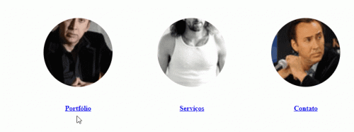
/*Destaques*/<main>
<div class="linkshome">
<div class="czr-link-mask">
<a href="portfolio.html">
<div class="box">
<img src="https://placecage.com/100/100">
</div>
<h4>Portfólio</h4>
</a>
</div>
<div class="czr-link-mask">
<a href="portfolio.html">
<div class="box">
<img src="https://placecage.com/101/100">
</div>
<h4>Serviços</h4>
</a>
</div>
<div class="czr-link-mask">
<a href="portfolio.html">
<div class="box">
<img src="https://placecage.com/100/101">
</div>
<h4>Contato</h4>
</a>
</div>
</div>
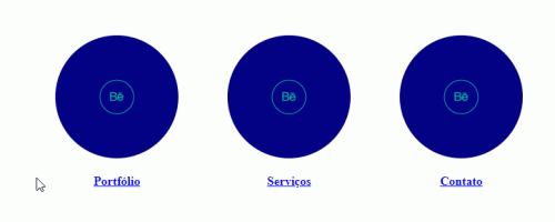
</main>Option for solid color
When the color of the box is solid it becomes even easier, because you can only work in: Hover of the box, you do not need a class for image or pseudo elements
main {
   margin-left: 90px;
   margin-right: 60px;
   padding: 20px;

}

.linkshome {
   display: flex;
   justify-content: center;
}

.linkshome h4 {
   text-align: center;
}

/*Efeito Destaques (ainda testando efeitos para portfolio,serviços e contato.jpg)*/

.czr-link-mask {
   margin: 2rem;
}
.czr-link-mask .box {
   display: flex;
   justify-content: center;
   align-items: center;
   width: 160px;
   height: 160px;
   border-radius: 50%;
   position: relative;
   background-color: navy;
   box-shadow: 0 0 0 0px navy;
   transition: box-shadow 300ms;
}
.czr-link-mask .box:hover {
   box-shadow: 0 0 0 10px navy;
}


/*Destaques*/
<main>
<div class="linkshome">
<div class="czr-link-mask">
<a href="portfolio.html">
<div class="box">
<img src="https://cdn1.iconfinder.com/data/icons/icons-for-sharing-your-works/48/Behance_2.png">
</div>
<h4>Portfólio</h4>
</a>
</div>
<div class="czr-link-mask">
<a href="portfolio.html">
<div class="box">
<img src="https://cdn1.iconfinder.com/data/icons/icons-for-sharing-your-works/48/Behance_2.png">
</div>
<h4>Serviços</h4>
</a>
</div>
<div class="czr-link-mask">
<a href="portfolio.html">
<div class="box">
<img src="https://cdn1.iconfinder.com/data/icons/icons-for-sharing-your-works/48/Behance_2.png">
</div>
<h4>Contato</h4>
</a>
</div>
</div>
</main>