How do I make a toggle-button in Blend?
I work in Blend for Visual Studio 2013, I needed to make a toggle-button, but all I know is a switch in the form of a button, where only one option of the switch position is visible at one time.
And so I needed to make it a little different: 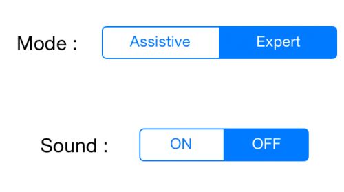
And I have no idea how to do this in Blend, because I worked there quite a bit, and there is no time to smoke manuals. If you don't mind, I would be grateful for a step-by-step guide, how to make a togglebutton identical to the one in the picture.
2 answers
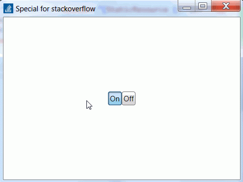
What is described in the neighboring answer is done much easier, without a codebehind:
<UniformGrid Rows="1">
    <UniformGrid.Resources>
        <Style TargetType="RadioButton" BasedOn="{StaticResource {x:Type ToggleButton}}"/>
    </UniformGrid.Resources>
    <RadioButton Content="On" IsChecked="True"/>
    <RadioButton Content="Off"/>
</UniformGrid>
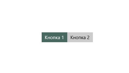
Probably the easiest solution is to use 2 ToggleButton buttons and 1 stack panel. The algorithm is as follows:
- Create a horizontal StackPanel and put 2 ToggleButtons in it. Subscribe to Checked and Unchecked these ToggleButtons.
- In the Checked and Unchecked handlers, we forcibly disable another ToggleBotton, i.e. if Checked_ToggleButton1, then we do Uncheked_ToggleButton2.
Here is the Xaml code:
        <StackPanel Margin="0" Orientation="Horizontal" HorizontalAlignment="Center" VerticalAlignment="Center">
        <ToggleButton x:Name="tgl1" Content="Кнопка 1" HorizontalAlignment="Left" VerticalAlignment="Top"/>
        <ToggleButton x:Name="tgl2" Content="Кнопка 2" HorizontalAlignment="Left" VerticalAlignment="Top"/>
    </StackPanel>
Here's C# code:
   public sealed partial class MainPage : Page
{
    public MainPage()
    {
        this.InitializeComponent();
        this.Loaded += MainPage_Loaded;
    }

    private void MainPage_Loaded(object sender, RoutedEventArgs e)
    {
        tgl1.Checked += Tgl1_Checked;
        tgl1.Unchecked += Tgl1_Unchecked;
        tgl2.Checked += Tgl2_Checked;
        tgl2.Unchecked += Tgl2_Unchecked;
        tgl1.IsChecked = true;
    }

    private void Tgl2_Unchecked(object sender, RoutedEventArgs e)
    {
        tgl1.IsChecked = true;
    }

    private void Tgl2_Checked(object sender, RoutedEventArgs e)
    {
        tgl1.IsChecked = false;
    }

    private void Tgl1_Unchecked(object sender, RoutedEventArgs e)
    {
        tgl2.IsChecked = true;
    }

    private void Tgl1_Checked(object sender, RoutedEventArgs e)
    {
        tgl2.IsChecked = false;
    }
}
As a result, we get this picture:
If I understand your question correctly, then this solution should help you.
P.s. Of course, this decision is just head-on. If you do it in a good way, you can create a UserControl, organize all the logic inside it, add the missing DependencyProperty, adjust the styles of the elements so that it is like yours.