How does grid system work?
I am using Bootstrap in a project, but so far I have not understood how the structure of the same works. It uses grids but the documentation is not quite clear about how it works and how to use it.
I want to put together a layout that is responsive but at the same time I want to know what I'm doing. I know that all CSS frameworks use grids, and I would like an explanation of how they work and how to use them to assemble a layout.
4 answers
What are CSS grids:
CSS Grids are nothing more than the" simulation " of a tabular structure by means of divs. If you started messing with the internet at the time of IE6 and the like, you should remember that tables were used a lot to structure HTML layouts. This was due to the fact that it was easier to work with Grid layout on the web, and the table had a grid-like behavior (a table of 10 rows x 10 columns would simulate a 10x10 grid).
O the problem is that tables have certain peculiarities, such as the fact that they do not get along very well with responsive layouts (after all, tables were thought to behave like "plastered" structures from the beginning), and semantically speaking, they are not recommended for use in building the layout of a page (as you think that a reader for the Blind will understand a page that is rather than showing tabular data?).
Combine these factors with the fact that layouts are becoming more complex every day and with an increasing number of devices of all sizes with internet access and it becomes clear that layouts using tables was never and would never be the best solution available.
It was then that the developers realized that if they could reproduce the grid functionality of a table, with the mobility and responsiveness of the block elements (divs) this would greatly facilitate the process of assembling layouts, being the perfect solution for finally substituting tables. Thus was born the concept of CSS grids.
Some of the advantages of using CSS grids are:
- semantically correct (layout elements being used for layout);
- allows easy stylization and malleability;
- allows the total restructuring of grid blocks according to with device size (try resizing your browser accessing the Bootstrap website);
How to use CSS grids:
As you said in your question, practically all CSS frameworks come with a grid system with them, and although the name of the classes changes, usually the structure is always the same (and will even remind you of the structure of a table):
[bloco-pai]
     |
     |----[linha]
     |       |
     |       |----[coluna]
This structure above can be described in HTML like:
<div class="bloco-pai">
    <div class="linha">
        <div class="coluna"></div>
    </div>
</div>
Each bloco-pai can have n rows, and each linha can have n columns (theoretically, although most frameworks accept a total of at most 12 or 24 columns)
As you can see, the structure of a CSS grid is very similar to the structure of a table, I will show an example:
<table> <!-- equivalente ao bloco-pai -->
    <tr> <!-- equivalente a linha -->
        <td></td> <!-- equivalente a coluna -->
    </tr>
</table>
Once you understand that the structure of a CSS grid is nothing more than the equivalent of the structure of a table, it becomes much easier to understand what you are doing in the code.
Well, what if I want to work with CSS grids, but using columns with distinct sizes?
That's where those classes with strange names from Bootstrap come in:
These classes, when added in a column define a specific size for it, which would be the equivalent of the colspan in the tables.
So let's go to one more example, this time using the Bootstrap:
<div class="container">
    <div class="row">
        <div class="col-md-8"></div> <!-- Esta coluna terá um tamanho de 8/12 -->
        <div class="col-md-4"></div> <!-- Esta coluna terá um tamanho de 4/12 -->
    </div>
</div>
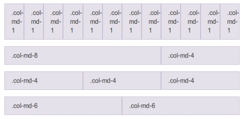
As you can see, the basic structure above will generate a grid with one row and two columns, one of size 8/12 (66.66%) and one of size 4/12 (33.33%).
Remembering that column sizes are usually never set to px (pixels), but rather to % (percentage), so that they always assume a percentage of the parent element size above them.
This means that if you created a parent element with a width of 1000px and if you added two columns with size 6/12 (i.e. 50%) inside it, those columns would assume 500px width each. If the size of the parent element was changed to 500px, both columns would now have 250px, and so on.
Well, CSS grids have a lot more advantages and extra details that if they were to be written here would end up generating a greater response than this already is, so I leave the rest as homework for you to read there in the documentation from Bootstrap .
Bonus:
For those who don't know, there is a CSS grid pattern being specified by W3C, and -pasmen-, IE10+ has already implemented the functionality. worth a look .
Although I consider the documentation quite complete, let's go.
Official Bootstrap grid system (English)
Bootstrap works by dividing the screen into 12 columns. Regardless of which device you are using, it uses 12 columns.
The devices it supports are 4:
Very wide screen (screens with size greater than or equal to 1200px): col-lg -
Wide screen (screens with larger size or equal to 992px): col-md -
Small screen (screens larger than or equal to 768px): col-sm -
Extremely small screen (usually mobile phones) (screens up to 767px in size): col-xs -
So if you want to build an area on your screen that uses 9 columns for the content on your left, and 3 for menu on the right. You should set this within a .container and inside a .row see the example for wide screens:
<div class="container">
     <div class="row">
          <div class="col-md-9">Conteúdo</div>
          <div class="col-md-3">Menu</div>
      </div>
</div>
Then, you need to study, follow this concept and see the link I posted, where you will begin to understand better.
There are several videos on youtube also teaching how to use Bootstrap: building with Bootstrap
This is just one of them... Remembering that most of the subjects will be in English since in pt - br only has an estimated 10% of all technological knowledge untranslated. But stay there, anything, just get in touch.
The grid system works with classes that include a width for their elements. Being from 1 to 12. So that 12 is the maximum width of your page.
Logo
<div class="col-md-12"></div> # represents a div that will have the maximum width of your page.
<div class="col-md-6"></div> # represents half of your page.
So if the maximum width is 12 and you want 2 divs in 1 row, then:
<div class="row">
<div class="col-md-6"></div><div class="col-md-6"></div> # 6 + 6 = 12
</div>
Understanding the class: col - columns md, xs, sm - devices that will have the measurement 1 ate 12 - width size
Soon, I can use:
<div class="col-md-6 col-xs-12"></div><div class="col-md-6 col-xs-12"></div> # 6 + 6 = 12
This means that in desktop screens I will have 2 columns of 6 and in extra small I will have 2 columns with 12, they will appear 1 per row in the case of xs.
I hope not to have been vague, but the documentation is more explanatory. Just study a little more:)
By default, the Bootstrap creates a grid with columns whose size is 100% of the parent container. For example, if you want to place a grid in a space of 960 pixels (a <div>, for example), the Bootstrap will generate a grid that harmoniously occupies this space.
What I think can generate some confusion is in the numbering (.col-md-3, col-md-4). This is because of the grid system 960 , which is an internet standard in which the average size of the displays gives more or minus 960 pixels. The idea is to divide your grid into a maximum of 12 columns, and each number of these represents the space in number of minimum columns it occupies.
In the first example we have a grid of one row and 3 columns, with the Class col-md-4. That is, they are 3 columns of size 4, that is, they occupy the space of 4 minimum columns.
The other examples are analogous.