How to animate a Radial-Gradient or linear gradient with CSS?
I'm trying to make an animation with CSS that would be of a " sun " passing through an image.
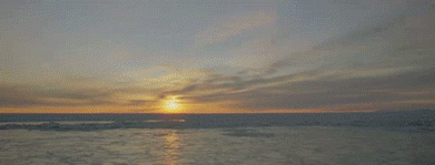
The idea was to have something close to of this result:
But in my code the "sun" is jumping from one side to the other and does not get excited in the right way. How do I animate with CSS this readial-gradient (or linear-gradiente) the right way?
I tried to use @keyframes and change the properties
From: radial-gradient(circle at 100% 50%...
For: radial-gradient(circle at 0% 50%...
But it didn't work out as you can see below
.box {
    width: 300px;
    height: 150px;
    background-image: radial-gradient(circle at 100% 50%, rgba(255, 155, 61, 0.473), transparent 25%), url(https://unsplash.it/300/150?image=986);
    background-size: cover;
    background-repeat: no-repeat;
    animation: bg 3s linear infinite, none;
}
@keyframes bg {
    to {
    background-image: radial-gradient(circle at 0% 50%, rgba(255, 155, 61, 0.473), transparent 25%), url(https://unsplash.it/300/150?image=986);
    }
}
<div class="box"></div>2 answers
With @keyframe you can tell animation when to perform such an action using percentage values. That would be the phases of the animation and that values you define.
Following more or less what you need:
.box {
    width: 300px;
    height: 150px;
    background-image: radial-gradient(circle at 100% 50%, rgba(255, 155, 61, 0.473), transparent 25%), url(https://unsplash.it/300/150?image=986);
    background-size: cover;
    background-repeat: no-repeat;
    animation: bg 3s linear infinite, none;
}
@keyframes bg {
    0%{
       background-image: radial-gradient(circle at 0% 50%, rgba(255, 155, 61, 0.473), transparent 25%), url(https://unsplash.it/300/150?image=986);
    }
    15%{
       background-image: radial-gradient(circle at 30% 50%, rgba(255, 155, 61, 0.473), transparent 25%), url(https://unsplash.it/300/150?image=986);
    }
    30%{
       background-image: radial-gradient(circle at 30% 50%, rgba(255, 155, 61, 0.473), transparent 25%), url(https://unsplash.it/300/150?image=986);
    }
    50%{
       background-image: radial-gradient(circle at 50% 60%, rgba(255, 155, 61, 0.473), transparent 25%), url(https://unsplash.it/300/150?image=986);
    }
    75%{
       background-image: radial-gradient(circle at 75% 60%, rgba(255, 155, 61, 0.473), transparent 25%), url(https://unsplash.it/300/150?image=986);
    }
    90%{
       background-image: radial-gradient(circle at 90% 50%, rgba(255, 155, 61, 0.473), transparent 25%), url(https://unsplash.it/300/150?image=986);
    }
}
<div class="box"></div>As I had commented, I was able to find examples similar to the one below, working the background and gradient separately:
.box {
    width: 300px;
    height: 150px;
    background-image: url(https://unsplash.it/300/150?image=986);
    position: relative;
}

.sol{
    width: 100%;
    height: 100px;
    background-image: radial-gradient(circle, rgba(255, 155, 61, 0.473), transparent 25%);
    background-position: 110px 0px;
    position: absolute;
    background-repeat: none;
    -webkit-animation: sol 5s ease infinite;
}

@-webkit-keyframes sol {
  from{
    background-position: 110px 0px;
  }
  to{
    background-position: -110px 0px;
  }
}
<div class="box"><div class="sol"></div></div>I arrived at a solution using background-size and background-position.
The idea is that vc has a background that is greater than 100% of the size of the container. For this you just have to put values like background-size:200% or 300%, after that as the background-position you put the bg to one side or the other.
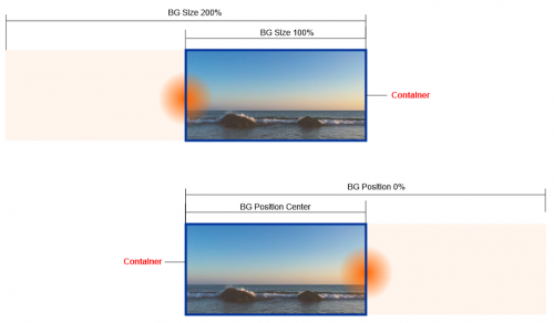
See the code to better understand:
.box {
  width: 300px;
  height: 150px;
  background-image: radial-gradient(circle, rgba(255, 166, 0, 0.7), transparent 25%), url(https://unsplash.it/300/150?image=986);
  background-size: 200% 100%, cover;
  background-position: 100% 50%, center;
  background-repeat: no-repeat;
  animation: bg 3s linear infinite, none;
}
@keyframes bg {
  to {
    background-position: 0% 50%;
  }
}
<div class="box"></div>