How to break a line in the chart title into 2 lines using ggplot?
I need to break the chart's title line so that it is at the width of the chart itself. The reason is that the graph will be used in a grid.arrange() and in this way it will become narrow and the title passing the width in which the graph will have.
Here's a sample of the data
> dput(dados)
structure(list(grupo = structure(c(1L, 1L, 1L, 1L, 1L, 1L, 1L,
1L, 1L, 1L, 1L, 1L, 1L, 1L, 1L, 1L, 1L, 1L, 1L, 1L, 2L, 2L, 2L,
2L, 2L, 2L, 2L, 2L, 2L, 2L, 2L, 2L, 2L, 2L, 2L, 2L, 2L, 2L, 2L,
2L), .Label = c("TOC", "TA"), class = "factor"), a = c(9, 5,
2, 1, 3, 7, 16, 15, 4, 20, 6, 10, 13, 19, 18, 11, 8, 12, 17,
14, 21, 28, 25, 33, 39, 40, 30, 29, 35, 32, 26, 23, 24, 36, 27,
37, 34, 38, 31, 22)), row.names = c(NA, -40L), class = "data.frame")
>
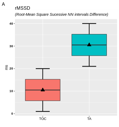
And here is the graph from the data.
ggplot(dados, aes(grupo, a)) +
  stat_boxplot(geom = "errorbar", size = 1, width = 0.3) +
  geom_boxplot(aes(fill = grupo), show.legend = F) +
  stat_summary(fun.y=mean, geom="point", shape=17, size=4) +
  labs(title = "rMSSD (Root-Mean Square Sucessive NN intervals Difference)",
       x = "", y = "ms",
       tag = "A") +
  theme(axis.text.x = element_text(size = 10, color = "Black"),
        axis.text.y = element_text(face = "bold", color = "black"))
An additional question: because it is an English name of the acronym rMSSD. How to leave only what is it in brackets in italics?
1
Author: gleidsonmr, 2019-08-01
1 answers
You can break the title with title and subtitle.
And to have text in italics, one can do with bquote and plotmath.
library(ggplot2)

ggplot(dados, aes(grupo, a)) +
  stat_boxplot(geom = "errorbar", size = 1, width = 0.3) +
  geom_boxplot(aes(fill = grupo), show.legend = F) +
  stat_summary(fun.y=mean, geom="point", shape=17, size=4) +
  labs(title = 'rMSSD',
       subtitle = bquote(italic('(Root-Mean Square Sucessive NN intervals Difference)')),
       x = "", y = "ms",
       tag = "A") +
  theme(axis.text.x = element_text(size = 10, color = "Black"),
        axis.text.y = element_text(face = "bold", color = "black"))
1
Author: Rui Barradas, 2019-08-01 21:20:41