How to change the image displayed on the Desktop and Mobile versions of a website
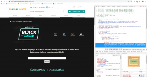
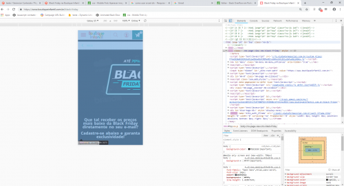
I needed the desktop version of a website to display an image and the mobile version to display another image.
Being that on the desktop the counter would be on top of the image (as it already is) and on mobile would show another image, and the counter below.
The page is this:
I don't have much programming experience.
1
Author: Pedro Gaspar, 2018-10-16
1 answers
In your CSS file you can use Media Query, which allows you to change the behavior of CSS for different resolutions.
In this case the ideal would be to have two different images in your html. The desktop image is visible by default, and the mobile image is hidden
Through the example below ((max-width: 700px)) if the screen resolution is at most 700px, you can put custom css code that will work only on that situation.
Example:
/** Para mostrar somente no celular*/
@media (max-width: 700px)
{
  .imagem_mobile
   {
       display: block;
   }
   .imagem_desktop{
       display: none;
   }
}
1
Author: Roberto Compassi, 2018-10-16 21:52:04