How to change the scale of the Y-axis in a line chart
I'm trying to plot a graph where the points on the Y-axis vary in decimal places but I couldn't adjust the scale of the axis so that it varies in decimal places as well.
t_mean = c(30.24, 30.73, 30.94, 31.97, 31.28, 31.84, 31.56, 32.00)
time = c(0,2,4,6,8,10,12,14)
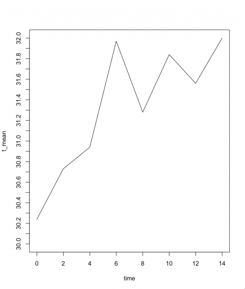
plot=(t_mean~time, type ="l", ylim=c(30.0,32), yaxt ="n")
axis(2, at=c(30.0:32.0))
1 answers
One way to do this is by creating a vector with the function seq. As the name suggests, the function seq creates a sequence of numbers. Simply enter the initial value, the final value and the increment. In the example below, I create a sequence that starts at 30 and goes up to 32, increasing from 0.1 to 0.1:
seq(from=30, to=32, by=0.1)
 [1] 30.0 30.1 30.2 30.3 30.4 30.5 30.6 30.7 30.8 30.9 31.0 31.1 31.2 31.3 31.4
[16] 31.5 31.6 31.7 31.8 31.9 32.0
Now just put this command inside the function axis of your code:
t_mean = c(30.24, 30.73, 30.94, 31.97, 31.28, 31.84, 31.56, 32.00)
time   = c(0,2,4,6,8,10,12,14)

plot(t_mean~time, type ="l",  ylim=c(30.0,32), yaxt ="n")
axis(2, at=seq(from=30, to=32, by=0.1))
Attention: depending on the screen size of your computer or resolution of it, it may be that not all the desired numbers appear when rotating the code I passed. See what happens when I generate this same image on my computer, which has 13-inch screen and without using zoom:
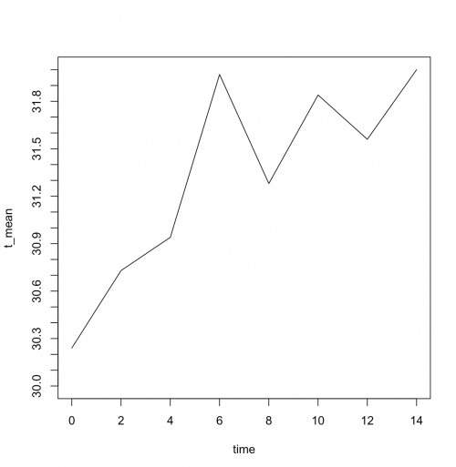
Notice that the numbers are no longer ranging from 0.2 to 0.2, but from 0.3 to 0.3. If I wanted the variation to be identical to the one originally defined, from 0.1 to 0.1, I would have to compulsorily reduce the graph source through the function par with the appropriate argument cex:
par(cex=.5)
plot(t_mean~time, type ="l",  ylim=c(30.0,32), yaxt ="n")
axis(2, at=seq(from=30, to=32, by=0.1))
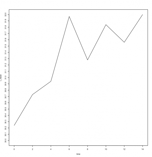
Note that all decimal values between 30 and 32 appeared, but the visualization did not look good. It is the duty of the one who is producing the chart to decide what is the best way to present it. None of the three I've presented here are wrong, but in my opinion, the first (ranging from 0.2 to 0.2) is the best.