How to create bar chart using DataFrame.plot?
I'm trying to make a graph of a table comparing the rate of non-literate men with the rate of non-literate women. I have a csv file with this data and I'm trying to put the men and women in the "x" line and the amount of non-literate people in the "y" line, so far my code looks like this:
import pandas as pd
import matplotlib.pyplot as plt

df = pd.read_csv("https://drive.google.com/uc?export=download&id=1k_kvlZ6zpnMeHUoA7GCEoMkKc7ybQLCX", sep=';' , encoding='latin-1')
df["qnthomens"] = df["HomensNaoAlfabetRural"] + df["HomensNaoAlfabetUrb"]
df["qntmulheres"] = df["MulheresNaoAlfabetRural"] + df["MulheresNaoAlfabetUrb"]
quantidade = df["qntmulheres"] and df["qnthomens"]
df["quantidade"] = quantidade
sexo = ['Homens', 'Mulheres']
df["sexo"] = sexo


plt.title('Homens x Mulheres')
df.plot(kind='bar',x='sexo',y='quantidade')
plt.show()
I'm trying to create a "quantity" column and put two different values inside it, the sum of the non-literate men of urban and rural areas, and also the sum of non-literate women from the same areas
Already in the column " sex "that I created I entered" men " and "women" to stay in the line" x " of the graph, but I report the error
ValueError: The truth value of a Series is ambiguous. Use a.empty, a.bool(), a.item(), a.any() or a.all().
I've tried many ways and I have no idea what to do, I'm new to it and I don't find anything on the internet...
1 answers
If I understood well what you want to do, you don't need DataFrame.plot. It's simpler than that:
import pandas as pd
import matplotlib.pyplot as plt

df = pd.read_csv("tabela_trabalho2.csv", sep=';' , encoding='latin-1')
df["qnthomens"] = df["HomensNaoAlfabetRural"] + df["HomensNaoAlfabetUrb"]
df["qntmulheres"] = df["MulheresNaoAlfabetRural"] + df["MulheresNaoAlfabetUrb"]

x=[1,2]
plt.title('Homens x Mulheres')
plt.bar(x,height=[df["qnthomens"].sum(),df["qntmulheres"].sum()] )
plt.xticks(x, ('Homens','Mulheres'))
plt.show()
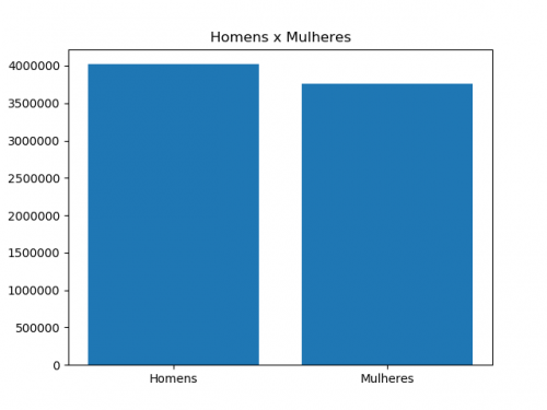
Implementing the bar chart with matplotlib directly has the benefit of being simpler. According to the documentation, the plt.bar only needs a sequence of scalars (which you can rename later) and a list with the heights of the bars.