How to make a round picture with a background using CSS, SVG?
I can't place the image correctly in the parent element – even though the image is set to the correct margins from the edges of the parent element, it continues to pop out.
Maybe I'm choosing the wrong implementation method altogether? Here is my code:
* {
padding: 0;
margin: 0;
}
.parent_block {
margin: 30px;
background: #eeeeee;
width: 195px;
height: 195px;
position: relative;
border-radius: 100%;
border: 1px solid black;
}
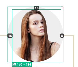
img {
position: absolute;
top: 10px;
left: 16px;
right: 8px;
width: 170px;
height: 184px;
}<div class="parent_block">
<img src="https://i.postimg.cc/QMsSJWR6/Photo.png" alt="photo">
</div>I need to do this:
3 answers
You can just position it exactly, without forgetting about the overflow: hidden for the container:
* {
  padding: 0;
  margin: 0;
}

.parent_block {
  position: relative;
  height: 195px;
  width: 195px;
  margin: 30px;
  overflow: hidden;
  border: 1px solid black;
  border-radius: 50%;
  background-color: #eeeeee;
}

img {
  position: absolute;
  bottom: -1px;
  left: 23px;
  height: 184px;
  width: 163px;
}
<div class="parent_block">
<img src="https://i.postimg.cc/QMsSJWR6/Photo.png" alt="photo">
</div>If the image is not loaded and is static, then you can get rid of the tag <img>:
* {
  padding: 0;
  margin: 0;
}

.avatar {
  position: relative;
  height: 195px;
  width: 195px;
  margin: 30px;
  overflow: hidden;
  box-shadow: inset 0 0 1px 1px black;
  border-radius: 50%;
  background-color: #eeeeee;
  background-image: url('https://i.postimg.cc/QMsSJWR6/Photo.png');
  background-position: 23px bottom;
  background-repeat: no-repeat;
  transition: box-shadow .3s ease;
}
.avatar:hover {
  box-shadow: inset 1px -36px 3px 83px black;
}
<div class="avatar"></div>For the future: do not crop images in advance, if they should have primitive shapes - this, firstly, will save you from unnecessary work in the image editor (and you can crop them using CSS). Secondly, it will be easier to position, because it is superfluous it will be cut off by the container, but there will be no struggle with the gaps.
SVG pattern solution
The solution is quite simple and universal.
I hope the comments in the code will help you understand the main points
<svg width="200" height="200" viewBox="0 0 200 200" version="1.1" xmlns="http://www.w3.org/2000/svg">
    <defs>
      <pattern id="img" patternUnits="userSpaceOnUse" width="100%" height="100%">
        <image xlink:href="https://i.postimg.cc/QMsSJWR6/Photo.png"  width="100%" height="100%" />
      </pattern>
    </defs>
      <!-- Фон -->
<circle cx="100" cy="100" r="100"  fill="#EEEEEE" />
    <!-- Изображение помещенное в круг с помощью паттерна -->
<circle cx="100" cy="100" r="100"  fill="url(#img)" />
</svg>CSS solution
.container {
width:200px;
height:200px;
}
img {
background:#eee;
width:200px;
height:200px;
  border-radius: 50%;
<div class-"container">
<img src="https://i.postimg.cc/QMsSJWR6/Photo.png" />
</div>Hover rotation
.container {
width:200px;
height:200px;
}
img {
background:#eee;
  border-radius: 50%;
  -webkit-transition: -webkit-transform 1.2s ease-in-out;
          transition:         transform 1.2s ease-in-out;
}
img:hover {
  -webkit-transform: rotate(360deg);
          transform: rotate(360deg);
}
<div class="container">
<img src="https://i.postimg.cc/QMsSJWR6/Photo.png" />
</div>