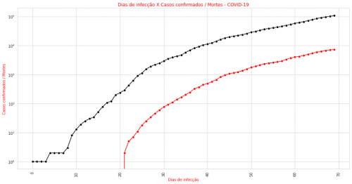
How to place the Y-axis value next to the chart marker?
Hello, I would like to see the Y-axis values also appear next to the points of the graph. I appreciate it now!
plt.figure(figsize = (16,8))
plt.xticks(rotation = 90)
sns.lineplot(x = dados_corona.index, y = 'Confirmados', data = dados_corona, marker = 'o', color = 'black')
sns.lineplot(x = dados_corona.index, y = 'Mortes', data = dados_corona, color = 'red', marker = 'o')
plt.title('Dias de infecção X Casos confirmados / Mortes - COVID-19', color = 'red')
plt.ylabel('Casos confirmados / Mortes', color = 'red')
plt.xlabel('Dias de infecção', color = 'red')
plt.yscale('log') #coloca o eixo y em escala logaritmica
plt.show()
The current result is the following graph:
0
1 answers
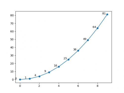
Use the ax.text method by passing to it the XY position of the text and the text to be displayed, for example:
import matplotlib.pyplot as plt

xs = range(10)
ys = [x**2 for x in xs]

fig, ax = plt.subplots()  # inicializa Figure e Axes
ax.plot(xs, ys, marker='o')
for x, y in zip(xs, ys):  # adiciona um texto para cada ponto XY
    ax.text(x-0.5, y+0.2, y)

plt.show()
Note that I added a small "deviation" when calling ax.text so that the text does not get on top of each point, making it difficult to read. You will have to test some deviation values until you find a good value for your graph, according to the limits of your X and Y axes.
Result:
0
Author: jfaccioni, 2020-05-05 20:20:37