How to plot a line chart with different colors depending on the value?
Suppose the following data:
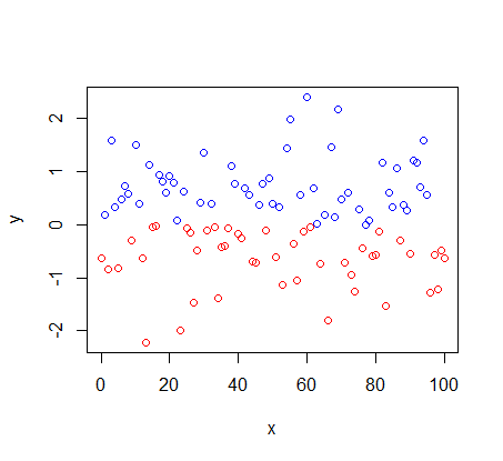
set.seed(1)
y<-rnorm(101)
x<-seq(from=0, to=100,by=1)
I want to make a plot with a line that has different color for negative values.
To make a point chart just the command below:
plot(x,y,col=ifelse(y>0,"blue","red"))
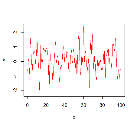
However, if I change to a line chart it doesn't work.
plot(x,y,col=ifelse(y>0,"blue","red"),type="l")
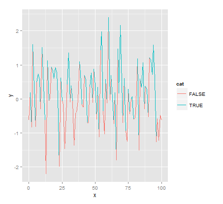
If I try to do with ggplot2 it's not working either. It assigns the line segment the color of the point previous.
library(ggplot2)
df<-data.frame(x,y)
df$cat<-y>0
ggplot(df,aes(x,y,color=cat)) + geom_path(aes(group=1))
How to make R correctly assign red color to negative values and blue color to positive values in the line plot?
5
1 answers
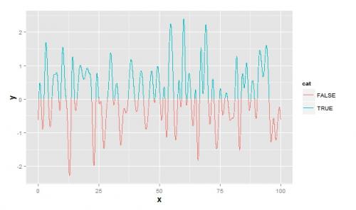
A partial "solution" would be to generate a spline with many points (about 100 for example) that there the colors would be less likely to be in the wrong place. But this solution can spend a lot of memory if your database is large and will smooth the graph. Ex:
df2 <- data.frame(spline(df$x, df$y, n = 100*nrow(df)))
df2$cat <- df2$y>0
ggplot(data = df, aes(x, y))+ geom_line(data=df2, aes(color=cat, group=1))
4
Author: Carlos Cinelli, 2014-03-19 17:19:51