How to use collapse in bootstrap?
<html lang="pt-br">
<body>
<?php
include_once 'header.php';
?>
<?php
if(!isset($_SESSION["email"]) || !isset($_SESSION["senha"])){
header("Location: logar.php");
exit;
}else{
}
?>
<link rel="stylesheet" href="Estilo/css/sidebar.css"/>
<div>
<section>
<hr class="m-0 mt-4">
<div class="d-flex" id="wrapper">
<!-- Sidebar -->
<div class="bg-light border-right" id="sidebar-wrapper">
<div class="sidebar-heading"><?php echo $_SESSION["nome"] ?> </div>
<div class="list-group list-group-flush">
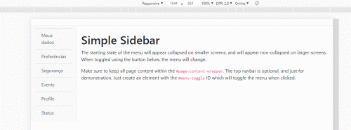
<a href="#" class="list-group-item list-group-item-action bg-light">Meus dados</a>
<a href="#" class="list-group-item list-group-item-action bg-light">Preferências</a>
<a href="#" class="list-group-item list-group-item-action bg-light">Segurança</a>
<a href="#" class="list-group-item list-group-item-action bg-light">Events</a>
<a href="#" class="list-group-item list-group-item-action bg-light">Profile</a>
<a href="#" class="list-group-item list-group-item-action bg-light">Status</a>
</div>
</div>
<!-- /#sidebar-wrapper -->
<!-- Page Content -->
<div id="page-content-wrapper">
<div class="container-fluid" id="menu-toggle">
<h1 class="mt-4">Simple Sidebar</h1>
<p>The starting state of the menu will appear collapsed on smaller screens, and will appear non-collapsed on larger screens. When toggled using the button below, the menu will change.</p>
<p>Make sure to keep all page content within the <code>#page-content-wrapper</code>. The top navbar is optional, and just for demonstration. Just create an element with the <code>#menu-toggle</code> ID which will toggle the menu when clicked.</p>
</div>
</div>
</section>
</div>
<?php
include_once 'footer.php';
?>
</body>
</html>
So I'm using this sidebar that I found on github, and since I'm new to it I wanted to know how to make the menu disappear when the screen goes down, same as the bootstrap navbar, I'm not sure but I think it's the collapse function that does it. So how do I use it there in the sidebar?
1
1 answers
From what I understand you want to use the toggle component of the navbar Bootstrap in your correct sidebar. For this you have to use some nav properties in your sidebar as navbar-expand-lg, in addition you need to insert in HTML button that will make toggle to expand and collapse to sidebar. in this example I used bootstrap's own button, but you can customize it if you want...
Follows the image code above
<!DOCTYPE html>
<html lang="en">

<head>
<meta charset="utf-8" />
<title>Page Title</title>
<meta name="viewport" content="width=device-width, initial-scale=1">
<link rel="stylesheet" type="text/css" media="screen" href="https://stackpath.bootstrapcdn.com/bootstrap/4.2.1/css/bootstrap.min.css" />
<link rel="stylesheet" type="text/css" media="screen" href="https://cdnjs.cloudflare.com/ajax/libs/font-awesome/5.8.2/css/all.min.css" />
<style>

</style>
</head>

<body>


    <div>
        <section>
            <hr class="m-0 mt-4">
            <div class="d-flex" id="wrapper">

                <!-- Sidebar -->
                <div class="navbar navbar-expand-lg navbar-light bg-light border-right" id="sidebar-wrapper">
                    <button class="navbar-toggler align-self-start" type="button" data-toggle="collapse" data-target="#navbarSupportedContent" aria-controls="navbarSupportedContent" aria-expanded="false" aria-label="Toggle navigation">
                        <span class="navbar-toggler-icon"></span>
                    </button>

                    <div class="collapse navbar-collapse" id="navbarSupportedContent">

                        <div class="sidebar-heading"><?php echo $_SESSION["nome"] ?> </div>
                        <div class="list-group list-group-flush">
                            <a href="#" class="list-group-item list-group-item-action bg-light">Meus dados</a>
                            <a href="#" class="list-group-item list-group-item-action bg-light">Preferências</a>
                            <a href="#" class="list-group-item list-group-item-action bg-light">Segurança</a>
                            <a href="#" class="list-group-item list-group-item-action bg-light">Events</a>
                            <a href="#" class="list-group-item list-group-item-action bg-light">Profile</a>
                            <a href="#" class="list-group-item list-group-item-action bg-light">Status</a>
                        </div>
                    </div>
                </div>
                <!-- /#sidebar-wrapper -->

                <!-- Page Content -->
                <div id="page-content-wrapper">
                    <div class="container-fluid" id="menu-toggle">


                        <h1 class="mt-4">Simple Sidebar</h1>
                        <p>The starting state of the menu will appear collapsed on smaller screens, and will appear non-collapsed on larger screens. When toggled using the button below, the menu will change.</p>
                        <p>Make sure to keep all page content within the <code>#page-content-wrapper</code>. The top navbar is optional, and just for demonstration. Just create an element with the <code>#menu-toggle</code> ID which will toggle the menu when clicked.</p>
                    </div>
                </div>

            </div>
        </section>
    </div>

    <script src="https://code.jquery.com/jquery-3.2.1.min.js"></script>
    <script src="https://cdnjs.cloudflare.com/ajax/libs/popper.js/1.12.9/umd/popper.min.js"></script>
    <script src="https://stackpath.bootstrapcdn.com/bootstrap/4.2.1/js/bootstrap.min.js"></script>
</body>

</html>
0
Author: hugocsl, 2019-08-26 11:04:53