Image is being cropped when the "max-width" CSS element is used
In the footer of this Wordpress site there are several logo images.
These images are inserted by the site administrator user himself inside a table Pods , so I have no individual control for each image, I just need to apply a pattern to all image.
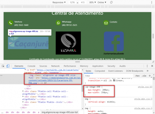
The original dimensions of the images are very different, so I need to restrict their sizes using max-width and max-height, which I I put in class wp-image-490:
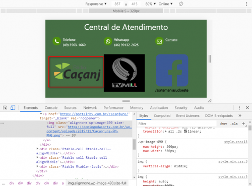
But in doing so, if I reduce the screen size (to test responsiveness), the first image is being cropped:
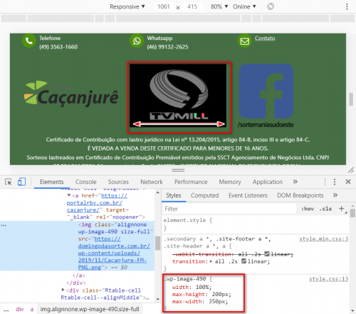
And at the same time, I tried to fix this by inserting width: 100% in this same class, but in doing so, the second image gets distorted:
Could anyone help?
1 answers
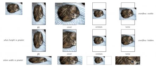
So these problems vc can work around by limiting the image inside the rendering container itself using object-fit: contain. What I want to say is that the image will render so that it fits proportionally within the width and height that you determined.
This documentation will help you: https://developer.mozilla.org/pt-BR/docs/Web/CSS/object-fit
And this image will help you better understand


