Line chart with months on the X axis in ggplot-R
I'm doing R classes and an exercise came up to make a line chart in ggplot2 with the data of flight delays by airport.
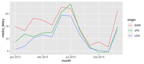
On the X axis should be the months (which are in numbers), but when I plot, it shows intervals of 2,5 (the graph ends up showing up to the month 12,5!).
I've tried turning the months into factors and still keeps showing in 2,5. I did not find in help the use of "breaks".
Does anyone have any idea what the problem is and how to solve?
library(tidyverse)
library(nycflights13)
voo <- flights

voo %>% group_by(month, origin) %>%
  summarize(media_delay = mean(dep_delay, na.rm = T)) %>%
  ggplot() +
  geom_line(aes(x = month, y = media_delay, group = origin, col = origin))
1 answers
The central in ggplot is always your data. Your data is in a numeric format, and so ggplot believes it is best to use a continuous scale in X and do the division in such a way that the intervals that appear are2.5 in 2.5.
There are several ways to fix this:
- specify the range you want to keep the scale continuous;
- transform data into categorical to force all data to appear;
- transform the data in date to use the date scale in the chart.
Option 2 will not be shown because it is an option that, although it can solve some specific problem, can also include new problems (such as how to sort the values, etc.) and does not correspond to an adequate representation of the variable.
1. Number scale intervals
To do this simply include the desired breaks in the numerical scale with the arguments breaks of the function scale_x_continuous().
voo %>% group_by(month, origin) %>%
  summarize(media_delay = mean(dep_delay, na.rm = T)) %>%
  ggplot() +
  geom_line(aes(x = month, y = media_delay, group = origin, col = origin)) +
  scale_x_continuous(breaks = 1:12)
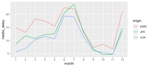
To see more about scales in ggplot, see this link
2. Time scale
In this case, we will not even need to set the scale, but change the variable and rely on the standards of ggplot. To do this, simply turn the column month into a variable of type date keeping the same command as the question to create the graph.
voo %>%
  # Adiciona zeros a esquerda
  mutate(month = formatC(month, width = 2, flag = "0"),
         day = formatC(day, width = 2, flag = "0"),
         month = lubridate::ymd(paste0(year, month, day)),
         month = lubridate::floor_date(month, "month")) %>%
  group_by(month, origin) %>%
  summarize(media_delay = mean(dep_delay, na.rm = T)) %>%
  ggplot() +
  geom_line(aes(x = month, y = media_delay, group = origin, col = origin))