List grid and list view with bootstrap 4
I would like to know if I can do this Effect that clicks on the icon above and the thumbnail changes list mode to mogo grid with bootstrap 4 I'm worrying on the internet some ready example more I just think of bootstrap 3
1
1 answers
Bootstrap 4's default Grid is in Flex, so vc can switch between row and column using native BS4 classes and fewer CSS lines.
As jQuery tb is standard BS4 I used it to make a toggleClass adding and removing the Class flex-column (original BS4 class) and switching between row and column, but tb I had to set flex:1 for the grid to be adjusted and responsive without problems. (actually this is the only style you need, the rest of the CSS I just did for you better view the grid)
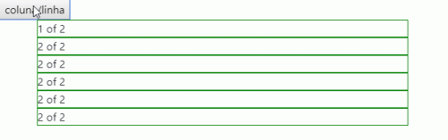
Above image Code:
<!DOCTYPE html>
<html lang="en">
<head>
    <meta charset="utf-8" />
    <title>Page Title</title>
    <meta name="viewport" content="width=device-width, initial-scale=1">
    <link rel="stylesheet" type="text/css" media="screen" href="https://maxcdn.bootstrapcdn.com/bootstrap/4.0.0-beta.2/css/bootstrap.min.css" integrity="sha384-PsH8R72JQ3SOdhVi3uxftmaW6Vc51MKb0q5P2rRUpPvrszuE4W1povHYgTpBfshb" crossorigin="anonymous" />
    <link rel="stylesheet" type="text/css" media="screen" href="https://maxcdn.bootstrapcdn.com/font-awesome/4.7.0/css/font-awesome.min.css" />
<style>
    div[class^="col"] {
        height: 50px;
        box-sizing: border-box;
        border: 1px solid green;
        flex: 1;
    }
.coluna {
    flex-direction: column;
}

</style>
</head>
<body>
    <button>coluna/linha</button>
    <div class="container">
        <div id="colunaX" class="row flex-column">
          <div class="col-xs-2">
            1 of 2
          </div>
          <div class="col-xs-2">
            2 of 2
          </div>
          <div class="col-xs-2">
            2 of 2
          </div>
          <div class="col-xs-2">
            2 of 2
          </div>
          <div class="col-xs-2">
            2 of 2
          </div>
          <div class="col-xs-2">
            2 of 2
          </div>
        </div>
      </div>
    <script src="https://code.jquery.com/jquery-3.2.1.slim.min.js"></script>
    <script src="https://cdnjs.cloudflare.com/ajax/libs/popper.js/1.12.3/umd/popper.min.js"></script>
    <script src="https://maxcdn.bootstrapcdn.com/bootstrap/4.0.0-beta.2/js/bootstrap.min.js"></script>
    <script src="https://maxcdn.bootstrapcdn.com/bootstrap/4.0.0-beta.3/js/bootstrap.bundle.min.js"></script>

    <script>
    $("button").click(function(){
        $("#colunaX").toggleClass("flex-column");
    });
    </script>
</body>
</html>
1
Author: hugocsl, 2019-09-19 15:56:57