MacBook Pro Retina screen is breaking layout in Bootstrap CSS
How could I solve this, I have already tried this more did not work:
@media only screen and (-webkit-min-device-pixel-ratio: 1.5),
       only screen and (min-device-pixel-ratio : 1.5) and (min-width: 1200px) {
    .col-lg-6.widescreen {
        width: calc(100%/2.05);
    }
}
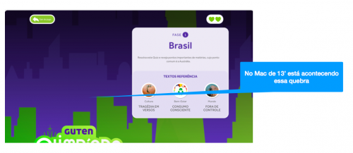
As it is appearing:
How it should look:

0
Author: Ivan Ferrer, 2018-09-12
1 answers
I solved the problem, it was a simple thing, the top column div, which encompassed the exit button of the game and lives was closing in the wrong place, right at the end of everything.
0
Author: Ivan Ferrer, 2018-09-13 19:46:06