Make the background image centered and full screen
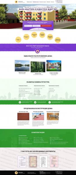
How do I make a background image centered and full-screen??? And to have the content in the middle, like a header? At first I was able to do this, but the image moved along with the content.. Don't do that. You need the image to be centered and full screen. You need the content to be centered, like the header.. How to implement it? I attach the layout.
@font-face {
  font-family: 'Roboto Slab';
  src: url('../fonts/RobotoSlabBold.eot'); /* IE9 Compat Modes */
  src: url('../fonts/RobotoSlabBold.eot?#iefix') format('embedded-opentype'), /* IE6-IE8 */
       url('../fonts/RobotoSlabBold.woff2') format('woff2'), /* Super Modern Browsers */
       url('../fonts/RobotoSlabBold.woff') format('woff'), /* Pretty Modern Browsers */
       url('../fonts/RobotoSlabBold.ttf')  format('truetype'), /* Safari, Android, iOS */
       url('../fonts/RobotoSlabBold.svg#svgFontName') format('svg'); /* Legacy iOS */
}
body {
	padding: 0;
	margin: 0;
	font-family: 'Roboto Slab';
	font-size: 15px;
	font-weight: normal;
	width: 100%;
}
					/* Header*/
header {
	width: 1350px;
	height: 100px;
	margin: 0px auto;
}
header li {
	display: inline-block;
	margin-top: 20px;

}
header a {
	text-decoration: none;
}
.header__feedback {
	float: right;
	width: 200px;
	height: 80px;
	font-size: 21px;
	font-weight: bold;
	margin-top: 10px;
}
.header__logo {
	display: inline-block;
	float: left;
	margin-top: 10px;
}
.header__menu_list {
	display: inline-block;
}
.header__feedback_icon img {
	width: 20px;
	float: left;
	margin-top: 9px;
	margin-left: 4px;
}
.header__feedback_items {
	font-size: 14px;
	width: 156px;
	height: 38px;
	border: 1px solid #2f1059;
	border-radius: 5px;
	line-height: 38px;
	margin-top: 8px;
	margin-left: 25px;
}
.header__feedback_button a {
	font-size: 14px;
	font-weight: bold;
}
.header__feedback_number {
	color: #2f1059;
}
.header__menu_list_item1 {
	margin-left: 50px;
}
.header__menu_list_item2,
.header__menu_list_item3,
.header__menu_list_item4,
.header__menu_list_item5 {
	margin-left: 20px;
}
					/* Header END*/
					/* Section1*/
section {
	width: 1350px;
	height: 655px;
	margin: 0 auto;
}
.section1 {
	background: url('../img/background.jpg') no-repeat center top scroll;
	min-height: 655px;
}
.section1__heading_paragraph_up {
	font-size: 22px;
	font-weight: normal;
}
.section1__heading h1 {
	font-size: 43px;
	font-weight: bold;
}
<!DOCTYPE html>
<html lang="ru">
<head>
<meta charset="UTF-8">
<title>Тренировка</title>
<link rel="stylesheet" href="css/style.css">
</head>
<body>
<header>
<nav>
<div class="header__logo">
<img src="img/logo2.png" alt="Logo">
</div>
<div class="header__menu_list">
<ul>
<li class="header__menu_list_item1"><a href="#">Инфраструктура</a></li>
<li class="header__menu_list_item2"><a href="#">Планировки и цены</a></li>
<li class="header__menu_list_item3"><a href="#">Материалы и отделка</a></li>
<li class="header__menu_list_item4"><a href="#">Документы</a></li>
<li class="header__menu_list_item5"><a href="#">Контакты</a></li>
</ul>
</div>
<div class="header__feedback">
<div class="header__feedback_number">
+ 7 (495) 544-23-12
</div>
<div class="header__feedback_items">
<div class="header__feedback_icon">
<img src="img/icon_phone.png" alt="icon">
</div>
<div class="header__feedback_button">
<a href="#">Заказать звонок</a>
</div>
</div>
</div>
</nav>
</header>
<section class="section1">
<div class="section1__heading">
<div class="section1__heading_paragraph_up">
Дом готов идет внутренняя отделка. Срок сдачи: Февраль 2016
</div>
<h1>Ваша квартира в новостройке ждет вас</h1>
<p class="section1__heading_paragraph_down">Уютные квартиры в центре города и в 5 минутых от р. Волга</p>
</div>
</section>
</body>
</html>1 answers
You have an image lying in the background on a block of fixed width (section), so that it is the full width you need to stretch the block to the full width of the screen.
If you need to make the image the full width of the screen, and the text in it is limited to the width 1350px make another nested block, section will be the entire width of the screen, and the nested block will be the width 1350px in the center.