Optimal maximum resolution for displaying content in mobile mode
Taking as an example the Bootstrap 4 grid system whose classes treat the content with specific breakpoints according to the resolution of the device's screen width (considering the viewport as container):
My doubt is as follows:
Is there a recommended optimal maximum resolution (or what is the recommended maximum resolution) to handle page content in format mobile (collapse menu, lay out wider elements one below the other etc.) so that there is a better relationship user experience / device used?
That is, up to X pixels screen width, it is more recommended to arrange the content in mobile mode , taking into account better viewing (image size and text) on mobile devices (tablets and smartphones) or even desktops with low resolution displays (e.g., netbooks, small displays). Considering also high-resolution smartphones and tablets. This is because if the page is displayed in desktop mode on a higher resolution smartphone, the elements can get too small on the screen, impairing the view.
1 answers
I don't think you have a single answer to your question. Much of it can be treated with this other question What is the difference between "Css resolution "and"Pixel resolution" where you can better see how is the difference in high and low density screens and how we can treat CSS using media queries rules like
@media (min-resolution: 2dppx) { ... } /* regra css para telas com 2x a densidade de  pixel */
@media (min-resolution: 3dppx) { ... } /* regra css para telas com 3x a densidade de pixel */
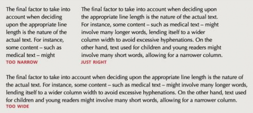
Another part of the answer may be based on typographic and UI concepts, where some good practices can be followed. As it has no lines long text, for example a line of text with more than 14 words, or a very wide inputs, but that the user will enter only a few little characters.
Ideally you have up to 14 words per line. But how will you handle this on a monitor that is 2,500 px wide? Probably you will need to" break " the text into 2 columns or more.
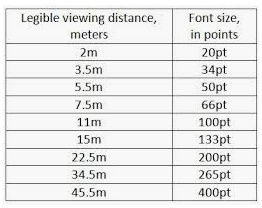
Another point is that usually on the desktop if it is close to the screen, on the mobile closer even then font-size doesn't have to be that big. Already on a presentation screen or TV vc is already quite far and the font-size needs to be treated, regardless of the resolution of the screen.
About images the ideal is that you use the SRCSET https://developer.mozilla.org/pt-BR/docs/Aprender/HTML/Multimedia_and_embedding/Responsive_images
<img srcset="imagem-320w.jpg 320w,
             imagem-480w.jpg 480w,
             imaem-800w.jpg 800w"
     sizes="(max-width: 320px) 280px,
            (max-width: 480px) 440px,
            800px"
     src="imagem-800w.jpg" alt="">
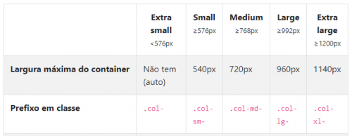
For Bootstrap it would be something like this
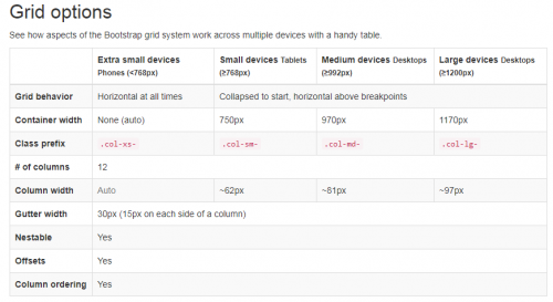
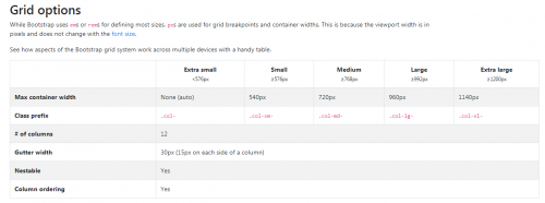
1 - if you are using Bootstrap with the default Grid vc would theoretically need the images at these resolutions. Here is the official documentation: https://getbootstrap.com/docs/4.0/layout/grid /
$grid-breakpoints: (
  // Extra small screen / phone
  xs: 0,
  // Small screen / phone
  sm: 576px,
  // Medium screen / tablet
  md: 768px,
  // Large screen / desktop
  lg: 992px,
  // Extra large screen / wide desktop
  xl: 1200px
);
2-to load the images with each of the grid resolutions would look something like this:
<picture>
    <source media="(min-width: 576px)" srcset="suaimagem-sm.png"/>
    <source media="(min-width: 768px)" srcset="suaimagem-md.png"/>
    <source media="(min-width: 992px)" srcset="suaimagem-lg.png"/>
    <source media="(min-width: 1200px)" srcset="suaimagem-lx.png"/>
    <img src="suaimagem-md.png" alt="">
<picture>
Another option would be to have a stylesheet for mobile.css and one for desktop.css, and identifying the type of access device by JS vc uses one sheet or another. A TB option is to use direct by the media attribute of the css link.
<link rel="stylesheet" href="mobile.css" media="screen and (max-width: 768px)" />
<link rel="stylesheet" href="desktop.css" media="screen and (min-width: 769px)" />
But this in this technique if the device is mobile, but is more than 768px wide, the user will end up loading the sheet desktop.css even if it is on the mobile... And so an approach recognizing the user-agent of the device by JS is better.
One thing that can help is to try to get Media Queries to get the orientation of the device if it is portrait or landscape.
And your @media would look something like this by example:
@media all and (orientation: portrait) { ... }

@media (min-width: 700px) and (orientation: landscape) { ... }
you can read more about CSS and device orientation here: https://developer.mozilla.org/pt-BR/docs/Web/Guide/CSS/CSS_Media_queries#orientation
Breakpoint
About the " Breaking Points" neither Google Nor Mozilla refer to this in their documentation. In fact what they recommend and use it da Meta Viewport and treat the layout in a way that is responsive and accessible.
follow official links with good practices.
- https://developer.mozilla.org/en-US/docs/Web/CSS/@media
- https://developers.google.com/web/fundamentals/design-and-ux/responsive /
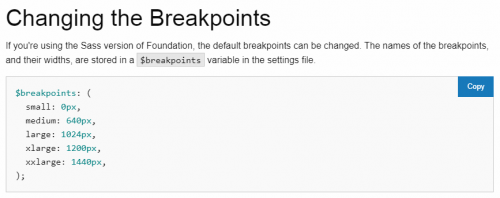
There is also not much consensus among the most famous System Design FrameWorks like Bootstrap , Materialize and foundation !
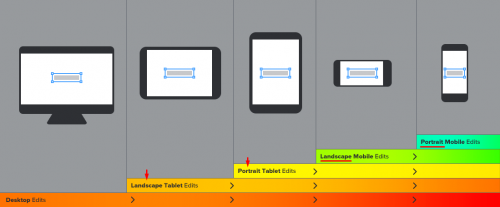
Notice below that each of them determines a different width for the Breaking Points of the Grid they use.
Bootstrap3 Breaking Points
Bootstrap4 Breaking Points
Materialize Breaking Points
Foundation Breaking Points
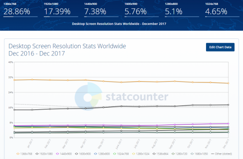
And to finish here is an excellent article on the most used screen sizes currently, the data are from December 2017. Article: https://www.hobo-web.co.uk/best-screen-size /
Desktop Screens
- 1366×768 – 29.25%
- 1920×1080 – 17.34%
- 1440×900 – 7.32%
- 1600×900 – 5.72%
- 1280×800 – 5.27%
- 1280×1024 – 4.51%
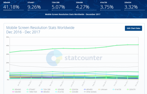
Telas Mobile
- 360×640 – 41.11%
- 375×667 – 9.58%
- 720×1280 – 5.16%
- 320×568 – 4.55%
- 414×736 – 3.79%
- 320×534 – 3.46%
Tabler Fabrics
- 768×1024 – 57.99%
- 1280×800 – 5.89%
- 600×1024 – 4.6%
- 601×962 – 3.02%
- 800×1280 – 2.94%
- 1024×600 – 2.36%
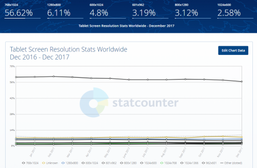
Source: http://gs.statcounter.com/screen-resolution-stats/tablet/worldwide
OBS : always consider your target audience and user experience before starting development!
I don't know if I touched all the points, but I believe I have something to give you a light.