Outline image with CSS text
I am developing a website, but without using any frameworkfor this; I want to point out that I only started in the studies of front, and that CSS is totally new to me.
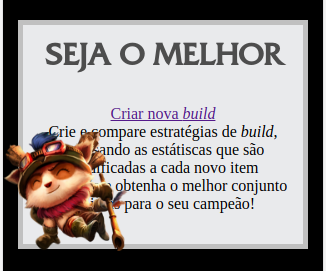
I'm trying to pin an image to a certain region of a div (this is ok) and allocate a text around it. However, it is not working as desired. Below is the image of what I have so far:
What I need is make the text "flow" around the character, but I have no idea how to do it, and I have already quite broken my head with this problem. All help is welcome. Follows the code I'm using tb:
HTML:
<section class="welcome">
    <h1>Seja o Melhor</h1>
    <img class="featured  put-on-top-left" src="img/teemo.png" alt="Conquiste a vitória!">
    <a class="featured-link" href="">Criar nova <em>build</em></a>
    <p class="get-around-right">Crie e compare estratégias de <em>build</em>, analisando as estátiscas que são modificadas a cada novo item escolhido e obtenha o melhor conjunto de itens para o seu campeão!</p>
</section>
CSS:
.welcome {
    padding: 15px;
    text-align: center;
    width: 250px;
    border: 5px solid #c0c0c0;
    margin: auto;
    margin-top: 50px;
    background-color: #e9eaec
}

.welcome h1 {
    font-family: 'roman-grids-cap';
    font-size: 2em;
    text-transform: uppercase;
    color: #4d4d4d
}

.featured {
    max-width: 125px;
    position: absolute;
    margin-top: 27px;
    left: 0px
}

.featured-link {
    display: block
}
Right now, I thank you for everything and qqr helps!
2 answers
Unfortunately I believe that what you want is not possible. The boundaries of HTML elements are all, by default, rectangles. You can even rotate them so that they become rhombuses or other shapes, but at the end of the day you will still have elements with boundaries set by four sides. Notice that this is because browsers ' HTML engine doesn't take into account things like image transparency.
Not possible, only with HTML , Javascript and CSS, make the text flow around a transparent image. You can try two alternatives:
Point Alternative: you can include direct text in the image. The advantage is that in this way you can make something really beautiful and that will have the same presentation in any browser. The downside is that this requires specific work for each different image - you can't reuse the solution easily between distinct images.
McGyver alternative: you can make the image float over the other components (i.e.:
position: absolute(orfixed)), and put several div's without text, but with width, behind the image. Each div would have a different length according to your need. The advantage is that it is not necessary to edit the image. But in addition to the same disadvantage of the previous method, you will need to test this in each browser and potentially have that develop a formatting for each different browser. Disclaimer: given the size of the gambiarra, this solution condemns your soul to an eternity of torment in hell after its disincarnation.
P.S.:
I am developing a website, but without using any framework for such(...)
You can look at the code as parts, and the frameworks as tools. It is completely possible to fix a nail on a wall or a screw on a board without the use of hammers or screwdrivers, but you will get hurt. Quite. And your friends will question your sanity. With programming is not much different.
I will post a more current answer, but it is not fully crossbrowser, does not work in IE or Edge, and only works in the latest version of FireFox (version 62+)
The idea here is to use the property shap-outside with a transparent background .png or with a clip-path and use it as a "mask" to float the text around the image. With this you achieve the effect of the text bypassing the image. In the case of .png it is the channel alpha that will cause the text to bypass the image, and in the case of clip-path is the very constructed shap that will take care of it. Detail that you may need margins or padding to move the text away from the image giving a breather between text and image.
- here you can consult your browser support for
shap-outside: https://caniuse.com/#feat=css-shapes - you can consult your browser support for
clip-pathhere: https://caniuse.com/#feat=css-clip-path
.box {
    box-sizing: border-box;
    padding: 1rem;
    width: 400px;
}
.imagem {
    width: 80px;
    height: 80px;
    float: left;
    shape-outside: url(https://vignette.wikia.nocookie.net/mario/images/0/0c/1000px-Mario_NSMB2.png/revision/latest?cb=20120920202215&path-prefix=pt-br);
    background-size: 80px 80px;
    padding-left: 15px;
    padding-right: -15px
}
.star {
    width: 80px;
    height: 80px;
    float: left;
    -webkit-clip-path: polygon(50% 0%, 61% 35%, 98% 35%, 68% 57%, 79% 91%, 50% 70%, 21% 91%, 32% 57%, 2% 35%, 39% 35%);
    clip-path: polygon(50% 0%, 61% 35%, 98% 35%, 68% 57%, 79% 91%, 50% 70%, 21% 91%, 32% 57%, 2% 35%, 39% 35%);
    shape-outside: polygon(50% 0%, 61% 35%, 98% 35%, 68% 57%, 79% 91%, 50% 70%, 21% 91%, 32% 57%, 2% 35%, 39% 35%);
    background-color: red;
    background-size: 100px 100px;
    margin-right: 1em;
}
.svgs {
width: 100px;
height: 100px;
float: left;
shape-outside: url(https://dev.w3.org/SVG/tools/svgweb/samples/svg-files/android.svg);
background-size: 100px 100px;
}
<div class="box">
<img class="imagem" src="https://vignette.wikia.nocookie.net/mario/images/0/0c/1000px-Mario_NSMB2.png/revision/latest?cb=20120920202215&path-prefix=pt-br" alt="">
<b>Usando .PNG</b>
<p>Lorem ipsum dolor sit, amet consectetur adipisicing elit. Expedita animi consequatur modi voluptates ea nobis veritatis accusantium vitae, earum officia?</p>
</div>
<div class="box">
<div class="star"></div>
<b>Usando clip-path</b>
<p>Lorem ipsum dolor sit, amet consectetur adipisicing elit. Expedita animi consequatur modi voluptates ea nobis veritatis accusantium vitae, earum officia? </p>
</div>
<div class="box">
<img class="svgs" src="https://dev.w3.org/SVG/tools/svgweb/samples/svg-files/android.svg" alt="">
<b>SVG não funciona no shap-outside</b>
<p>Lorem ipsum dolor sit, amet consectetur adipisicing elit. Expedita animi consequatur modi voluptates ea nobis veritatis accusantium vitae, earum officia? </p>
</div>Note: the effect using .png usually only works if the image is hosted on some server, even locally. So to test in local environment I suggest you access the files by localhost using Wamp, Xamp, etc, or put in the FTP of some server.
