Problem with bootstrap responsiveness
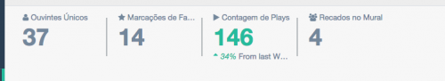
I'm having trouble aligning my dashboard responsiveness. Here a picture of how it looks on large screens.
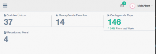
But if I lower the screen a little it shuffles like this:
Below the code excerpt HTML of the page where I quote this part. Am I doing something wrong? How can I fix this?
<div class="right_col" role="main">
        <!-- top tiles -->
        <div class="row tile_count">
          <div class="col-md-2 col-sm-4 col-xs-6 tile_stats_count">
            <span class="count_top">
              <i class="fa fa-user"></i> Ouvintes Únicos</span>
            <div class="count">37</div>
          </div>
          <div class="col-md-2 col-sm-4 col-xs-6 tile_stats_count">
            <span class="count_top">
              <i class="fa fa-star"></i> Marcações de Favoritos</span>
            <div class="count">14</div>
          </div>
          <div class="col-md-2 col-sm-4 col-xs-6 tile_stats_count">
            <span class="count_top">
              <i class="fa fa-play"></i> Contagem de Plays</span>
            <div class="count green">146</div>
            <span class="count_bottom">
              <i class="green">
                <i class="fa fa-sort-asc"></i>34% </i> From last Week</span>
          </div>
          <div class="col-md-2 col-sm-4 col-xs-6 tile_stats_count">
            <span class="count_top">
              <i class="fa fa-users"></i> Recados no Mural</span>
            <div class="count">4</div>
            <!-- <span class="count_bottom"><i class="red"><i class="fa fa-sort-desc"></i>12% </i> From last Week</span> -->
          </div>
        </div>
</div>
2 answers
You need to understand the main idea of grids :
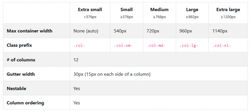
Let's go to the acronyms:
-sm: small-devices with a screen size greater than 576 pixels
-md: Medium-devices with a screen size greater than 768 pixels
-lg: Large-devices with a screen size greater than 992 pixels
-xl: Extra large-devices with a screen size greater than 1200 pixels
Whenever you insert a new column div, you use one of the size classes for example col-md-2 which says that the div will occupy 2 columns when the device is Medium(tablets or super small monitors), remember that the grid system can have up to 12 columns per row.
To solve your problem change the col-sm-4 to col-sm-6 so your div will occupy 6 columns on mobile devices i.e. you will have 2 divs per row, if you want each div to be in a line just put col-sm-12 and so on.
Bootstrap has a 12-column grid, when it reduces the resolution is applied to the class .col-in - 4 which means it will occupy the space of 4 columns.
As you are using 4x it will be equivalent 4x4 i.e. 16 columns so 4 more columns above the limit.
Try to put .col-sm-3 3x4 = 12
Check the Bootstrap grid documentation