Problems with thumbnails in List and grid mode with bootstrap
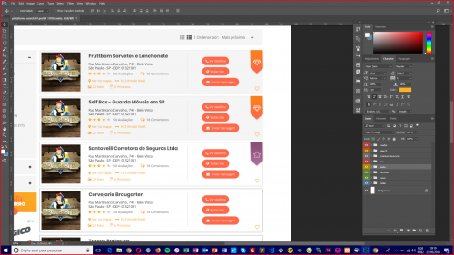
I need to make these cards stay in List Mode and grid mode I'm using flex-column to make the grids dynamic more when I add the cards they don't work anymore this is the list mode of my layout:
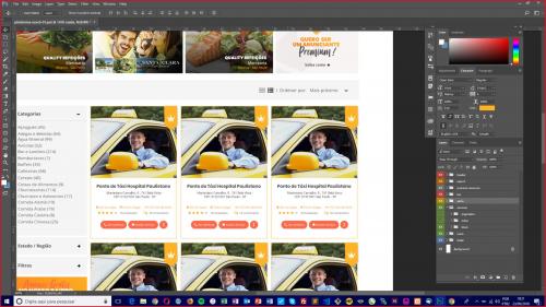
And this is a sketch of grid mode:
Follow My Code:
$(".button-thumb").click(function() {
  if ($(this).val() != "grid") {
    $("#list-grid").addClass("flex-column");
    $('#list').addClass('active');
    $('#grid').removeClass('active');
  } else {
    $("#list-grid").removeClass("flex-column");
    $('#grid').addClass('active');
    $('#list').removeClass('active');
  }

});
background-color: $light-gray;
padding: 15px;
.active {
color: $orange;
}
button {
cursor: pointer;
border: 0;
background-color: transparent;
outline: none;
color: $gray;
@include transition(all, .2s);
&:hover {
color: $orange;
}
}
label {
margin: 0;
font-family: 'Open Sans', sans-serif;
color: $gray;
}
select {
outline: none;
border: 0;
background-color: transparent;
color: $gray;
}
}<script src="https://ajax.googleapis.com/ajax/libs/jquery/2.1.1/jquery.min.js"></script>
<link rel="stylesheet" href="https://use.fontawesome.com/releases/v5.0.10/css/all.css" integrity="sha384-+d0P83n9kaQMCwj8F4RJB66tzIwOKmrdb46+porD/OvrJ+37WqIM7UoBtwHO6Nlg" crossorigin="anonymous">
<script src="https://stackpath.bootstrapcdn.com/bootstrap/4.1.1/js/bootstrap.min.js"></script>
<link rel="stylesheet" href="https://stackpath.bootstrapcdn.com/bootstrap/4.1.1/css/bootstrap.min.css" />
<div class="row mt-3">
<div class="col-md-12 text-right">
<div class="box-lists">
<button id="list" class="button-thumb active" value="list"><i class="fas fa-list-ul"></i></button>
<button id="grid" class="button-thumb" value="grid"><i class="fas fa-th"></i></button>
<label for="select"> | Ordenar por:</label>
<select id="select">
<option value="">Mais Próximo</option>
<option value="">Mais Distante</option>
<option value="">Mais visitados</option>
<option value="">Mais avaliados</option>
</select>
</div>
</div>
</div>
<div class="row mt-3">
<div class="col-md-8">
<div id="list-grid" class="row flex-column">
<div class="col-xs-2">
<div class="card mb-3">
<img class="card-img-top" src="http://via.placeholder.com/350x150" alt="Card image cap">
<div class="card-body">
<h5 class="card-title">Card title</h5>
<p class="card-text">This is a wider card with supporting text below as a natural lead-in to additional content. This content is a little bit longer.</p>
<p class="card-text"><small class="text-muted">Last updated 3 mins ago</small></p>
</div>
</div>
</div>
</div>
</div>
</div>In case I needed my cards to be the same as the first image plus when click on the mogo grid button they were the same as the second image.
2 answers
Gives:
<link rel="stylesheet" href="https://cdnjs.cloudflare.com/ajax/libs/font-awesome/4.7.0/css/font-awesome.min.css">

<style>
.column {
    float: left;
    width: 40%; // Alterar para 50% para tela cheia.
    padding: 10px;
}

.row:after {
    content: "";
    display: table;
    clear: both;
}
</style>

<button onclick="listView()"><i class="fa fa-bars"></i> Lista</button>
<button onclick="gridView()"><i class="fa fa-th-large"></i> Grid</button>

<div class="row">
  <div class="column" style="background-color:#aaa;">
    <h2>Coluna 1</h2>
    <p>Conteúdo 1</p>
  </div>
  <div class="column" style="background-color:#bbb;">
    <h2>Coluna 2</h2>
    <p>Conteúdo 2</p>
  </div>
</div>
<div class="row">
  <div class="column" style="background-color:#ccc;">
    <h2>Coluna 3</h2>
    <p>Conteúdo 3</p>
  </div>
  <div class="column" style="background-color:#ddd;">
    <h2>Coluna 4</h2>
    <p>Conteúdo 4</p>
  </div>
</div>

<script>
var elements = document.getElementsByClassName("column");

var i;

function listView() {
  for (i = 0; i < elements.length; i++) {
    elements[i].style.width = "100%";
  }
}

function gridView() {
  for (i = 0; i < elements.length; i++) {
    elements[i].style.width = "50%"; // Alterar para 50% para tela cheia.
  }
}
</script>
var elements = document.getElementsByClassName("column");

var i;

function listView() {
  for (i = 0; i < elements.length; i++) {
    elements[i].style.width = "100%";
  }
}

function gridView() {
  for (i = 0; i < elements.length; i++) {
    elements[i].style.width = "40%"; // Alterar para 50% para tela cheia.
  }
}
.column {
float: left;
width: 40%;
padding: 10px;
}
.row:after {
content: "";
display: table;
clear: both;
}<link rel="stylesheet" href="https://cdnjs.cloudflare.com/ajax/libs/font-awesome/4.7.0/css/font-awesome.min.css">
<button onclick="listView()"><i class="fa fa-bars"></i> Lista</button>
<button onclick="gridView()"><i class="fa fa-th-large"></i> Grid</button>
<div class="row">
<div class="column" style="background-color:#aaa;">
<h2>Coluna 1</h2>
<p>Conteúdo 1</p>
</div>
<div class="column" style="background-color:#bbb;">
<h2>Coluna 2</h2>
<p>Conteúdo 2</p>
</div>
</div>
<div class="row">
<div class="column" style="background-color:#ccc;">
<h2>Coluna 3</h2>
<p>Conteúdo 3</p>
</div>
<div class="column" style="background-color:#ddd;">
<h2>Coluna 4</h2>
<p>Conteúdo 4</p>
</div>
</div>Note that I formatted the divs with the use of CSS, I used 40% in width because here in the run example was not showing in grid, but you can adapt it to your layout, fully responsive. Inside the Div with the content, you enter the format according to its layout, with two columns, the first with "width 100%" when the Div receives the css value .column and removes the value of "width" when the Div has the css value, column stripped.
EDIT
Let's keep things simple:)
I redo the example using my other answer and putting the Card inside. Notice that the only thing I needed to do was adjust the column width with the class default col-8 and when the grid is listed I put the card with flex-direction: row
<!DOCTYPE html>
<html lang="en">
<head>
    <meta charset="utf-8" />
    <title>Page Title</title>
    <meta name="viewport" content="width=device-width, initial-scale=1">
    <link rel="stylesheet" type="text/css" media="screen" href="https://maxcdn.bootstrapcdn.com/bootstrap/4.0.0-beta.2/css/bootstrap.min.css" integrity="sha384-PsH8R72JQ3SOdhVi3uxftmaW6Vc51MKb0q5P2rRUpPvrszuE4W1povHYgTpBfshb" crossorigin="anonymous" />
    <link rel="stylesheet" type="text/css" media="screen" href="https://maxcdn.bootstrapcdn.com/font-awesome/4.7.0/css/font-awesome.min.css" />
<style>
    div[class^="col"] {
        box-sizing: border-box;
        border: 1px solid green;
        flex: 1;
    }
    .coluna {
        flex-direction: column;
    }
    .flex-column div > .card{
        flex-direction: row;
    }

</style>
</head>
<body>

    <button>coluna/linha</button>
    <div class="container">
        <div id="colunaX" class="row flex-column">
          <div class="col-8">
            <div class="card mb-3">
                <img class="card-img-top" src="http://via.placeholder.com/350x150" alt="Card image cap">
                <div class="card-body">
                    <h5 class="card-title">Card title</h5>
                    <p class="card-text">This is a wider card with supporting text below as a natural lead-in to additional content. This content is a little bit longer.</p>
                    <p class="card-text"><small class="text-muted">Last updated 3 mins ago</small></p>
                </div>
            </div>
          </div>
        </div>
      </div>


    <script src="https://code.jquery.com/jquery-3.2.1.slim.min.js"></script>
    <script src="https://cdnjs.cloudflare.com/ajax/libs/popper.js/1.12.3/umd/popper.min.js"></script>
    <script src="https://maxcdn.bootstrapcdn.com/bootstrap/4.0.0-beta.2/js/bootstrap.min.js"></script>
    <script src="https://maxcdn.bootstrapcdn.com/bootstrap/4.0.0-beta.3/js/bootstrap.bundle.min.js"></script>

    <script>
    $("button").click(function(){
        $("#colunaX").toggleClass("flex-column");
    });
    </script>
</body>
</html>
Young basically VC solves with this css when your grid is in list form. not tested because I do not have the compiled SCSS. OBS, I put a offset here to align on the right as it is in the layout col-md-8 offset-md-4
.card {
    flex-direction: row;
}
<!DOCTYPE html>
<html lang="en">
<head>
    <meta charset="utf-8" />
    <title>Page Title</title>
    <meta name="viewport" content="width=device-width, initial-scale=1">
    <link rel="stylesheet" type="text/css" media="screen" href="https://maxcdn.bootstrapcdn.com/bootstrap/4.0.0-beta.2/css/bootstrap.min.css"/>
    <link rel="stylesheet" type="text/css" media="screen" href="https://maxcdn.bootstrapcdn.com/font-awesome/4.7.0/css/font-awesome.min.css" />
<style>
.card {
    flex-direction: row;
}
</style>
</head>
<body>

<div class="row mt-3">
    <div class="col-md-12 text-right">
        <div class="box-lists">
            <button id="list" class="button-thumb active" value="list"><i class="fas fa-list-ul"></i></button>
            <button id="grid" class="button-thumb" value="grid"><i class="fas fa-th"></i></button>
            <label for="select"> | Ordenar por:</label>
            <select id="select">
                <option value="">Mais Próximo</option>
                <option value="">Mais Distante</option>
                <option value="">Mais visitados</option>
                <option value="">Mais avaliados</option>
        </select>
        </div>
    </div>
</div>

<div class="row mt-3">
    <div class="col-md-8 offset-md-4">
        <div id="list-grid" class="row flex-column">
            <div class="col-xs-2">
                <div class="card mb-3">
                    <img class="card-img-top" src="http://via.placeholder.com/350x150" alt="Card image cap">
                    <div class="card-body">
                        <h5 class="card-title">Card title</h5>
                        <p class="card-text">This is a wider card with supporting text below as a natural lead-in to additional content. This content is a little bit longer.</p>
                        <p class="card-text"><small class="text-muted">Last updated 3 mins ago</small></p>
                    </div>
                </div>
            </div>
        </div>
    </div>
</div>

    <script src="https://code.jquery.com/jquery-3.2.1.slim.min.js"></script>
    <script src="https://cdnjs.cloudflare.com/ajax/libs/popper.js/1.12.3/umd/popper.min.js"></script>
    <script src="https://maxcdn.bootstrapcdn.com/bootstrap/4.0.0-beta.2/js/bootstrap.min.js"></script>
    <script src="https://maxcdn.bootstrapcdn.com/bootstrap/4.0.0-beta.3/js/bootstrap.bundle.min.js"></script>

    <script>
    $(".button-thumb").click(function(){
        if($(this).val() != "grid"){
          $("#list-grid").addClass("flex-column");
          $('#list').addClass('active');
          $('#grid').removeClass('active');
        }else{
          $("#list-grid").removeClass("flex-column");
          $('#grid').addClass('active');
          $('#list').removeClass('active');
        }

    });
    </script>
</body>
</html>