R Histogram with all apparent breaks, hist function()
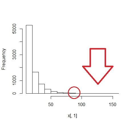
I have a database with more 8000 rows and I would like to create a histogram, but the same does not appear the bar in all classes of lower frequencies, in the case the last classes (image).
I understand that the 15th class disappears by presenting only 1 occurrence, when compared to the 1st class that presents more than 5 thousand.
However, is there any method in r capable of making these classes appear in the graph image?
I would like to make a histogram, with the Hist () function, with these same classes, grouped 10 by 10 as in the image, showing at least one darker bar in the lowest-occurring classes (red circle in the image)
Some histogram data:
h1[["counts"]]
 [1] 5291 1657  728  324  158   69   46   18    8   10    5    6    1    0    1

h1[["breaks"]]
 [1]  10  20  30  40  50  60  70  80  90 100 110 120 130 140 150 160
I tried to increase the amount of bars, but when I move the chart to png. some classes add up or get too small, because I need to plot 5 of these graphs in a png image.
Nessa configuration:
png(filename = "Figura1.png", width=620, height=1024,
    pointsize = 8, bg = "white", res = 120)

par(mfrow = c(5, 1), mar = c(4.5, 5, 1, 1) + 0.05)
Increasing the amount of bars:
h0 = hist(x[,1], breaks = seq(min(x[, 1]) - 0.5, max(x[, 1]) + 0.5, by = 0.5))

h0$density = h0$counts/sum(h0$counts)*100

plot(h0, freq = FALSE, main = " ")
1 answers
With the bar chart it is possible to use the log10 on the Y axis, already with the histogram I do not know.
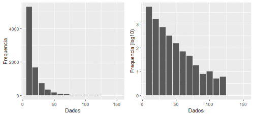
library(ggplot2)
library(gridExtra)

grafico_1 = ggplot(h1, aes(x=breaks, y=counts))+
  geom_bar(stat="identity") +
  xlab("Dados") +
  ylab("Frequencia")


grafico_2 = ggplot(h1, aes(x=breaks, y=log10(counts)))+
      geom_bar(stat="identity") +
      xlab("Dados") +
      ylab("Frequencia (log10)")

grid.arrange(grafico_1 , grafico_2 , ncol=2)