Responsive Menu using Bootstrap
I want to make a fixed menu using booststrap, in such a way that it is responsive; that is, when you lower the screen the menu turns an icon.
However, when I lower the viewport screen the icon appears to be there, but does not appear visually.
 <!-- NAV FIXED -->
 <nav class="navbar navbar-expand-lg fixed-top navegacao">
  <div class="container">
      <a href="#" class="navbar-brand">
          <img src="img/logo2.png" height="30">
      </a>
      <button class="navbar-toggler" type="button" data-toggle="collapse" data-target="#menu" aria-controls="menu" aria-expanded="false" aria-label="Menu Colapso">
       <span class="navbar-toggler-icon text-light"></span>
     </button>

     <div id="menu" class="collapse navbar-collapse">
        <ul class="navbar-nav ml-auto text-light nav-menu">
          <li class="nav-item">
             <a href="#header" class="nav-link text-light font-weight-bold">Item 1</a>
          </li>
          <li class="nav-item">
             <a href="#" class="nav-link text-light font-weight-bold">Item 2</a>
          </li>
          <li class="nav-item">
             <a href="#" class="nav-link text-light font-weight-bold">Item 3</a>
          </li>
          <li class="nav-item">
             <a href="#" class="nav-link text-light font-weight-bold">Item 4</a>
          </li>
          <li class="nav-item">
             <a href="#" class="nav-link text-light font-weight-bold">Item 5 </a>
          </li>
          <li class="nav-item">
             <a href="#" class="nav-link text-light font-weight-bold">Item 6 </a>
          </li>
          <li class="nav-item">
             <a href="#" class="nav-link text-light font-weight-bold" id="servicos">Item 7 </a>
          </li>
          <li class="nav-item">
             <a href="#" class="nav-link text-light font-weight-bold">Item 8 </a>
          </li>
         </ul>
       </div>
   </div>
CSS code:
.navegacao {
            height: 50px;
            background-color: black;
            box-shadow: 1px 2px #54542c;
            color: aliceblue;
            text-align: center;
}

.nav-menu > li {
            padding: 0 0 0 30px;
}
2 answers
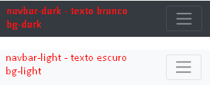
As you can see in the example below, the Hamburger menu is there, it turns out that your Css was overwriting that of Bootstrap. There are some classes that can help you style without having to mess with Css, such as navbar-dark for example that Arrow the background color of the menu bar to a dark gray tone, as you can best see here :
.navegacao {
  box-shadow: 1px 2px #54542c;
  text-align: center;
}

.nav-menu>li {
  padding: 0 0 0 30px;
}
<link rel="stylesheet" href="https://stackpath.bootstrapcdn.com/bootstrap/4.1.3/css/bootstrap.min.css">
<script src="https://code.jquery.com/jquery-3.3.1.slim.min.js"></script>
<script src="https://cdnjs.cloudflare.com/ajax/libs/popper.js/1.14.3/umd/popper.min.js"></script>
<script src="https://stackpath.bootstrapcdn.com/bootstrap/4.1.3/js/bootstrap.min.js"></script>
<!-- NAV FIXED -->
<nav class="navbar navbar-expand-lg fixed-top navbar-dark bg-dark navegacao">
<div class="container">
<a href="#" class="navbar-brand">
<img src="img/logo2.png" height="30">
</a>
<button class="navbar-toggler" type="button" data-toggle="collapse" data-target="#menu" aria-controls="menu" aria-expanded="false" aria-label="Menu Colapso">
<span class="navbar-toggler-icon text-light"></span>
</button>
<div id="menu" class="collapse navbar-collapse">
<ul class="navbar-nav ml-auto text-light nav-menu">
<li class="nav-item">
<a href="#header" class="nav-link text-light font-weight-bold">Item 1</a>
</li>
<li class="nav-item">
<a href="#" class="nav-link text-light font-weight-bold">Item 2</a>
</li>
<li class="nav-item">
<a href="#" class="nav-link text-light font-weight-bold">Item 3</a>
</li>
<li class="nav-item">
<a href="#" class="nav-link text-light font-weight-bold">Item 4</a>
</li>
<li class="nav-item">
<a href="#" class="nav-link text-light font-weight-bold">Item 5 </a>
</li>
<li class="nav-item">
<a href="#" class="nav-link text-light font-weight-bold">Item 6 </a>
</li>
<li class="nav-item">
<a href="#" class="nav-link text-light font-weight-bold" id="servicos">Item 7 </a>
</li>
<li class="nav-item">
<a href="#" class="nav-link text-light font-weight-bold">Item 8 </a>
</li>
</ul>
</div>
</div>
</nav>Is as follows, You stopped using the original Bootstrap color classes, type navbar-light or navbar-dark, as well as bg-light or bg-dark etc, so your button does not appear, because it only applies the color in it if you have a color class in navbar
A way to be able to put a color in button without getting stuck in the standard bootstrap colors and put the color manually by creating a class custom.
.custom .navbar-toggler-icon {
  background-image: url("data:image/svg+xml;charset=utf8,%3Csvg viewBox='0 0 32 32' xmlns='http://www.w3.org/2000/svg'%3E%3Cpath stroke='rgba(255,0,0, 1)' stroke-width='2' stroke-linecap='round' stroke-miterlimit='10' d='M4 8h24M4 16h24M4 24h24'/%3E%3C/svg%3E");
}

.custom.navbar-toggler {
  border-color: rgba(255,0,0,1);
}
If you repair you will see that inside the button has a span. In button stands the color of the border, and in that span inside is a background-imagem a svg that you can change the color to the color you want in stroke.
This is the default Bootstrap 4 button, it takes on the color along with the color classes
<button class="navbar-toggler custom" type="button" data-toggle="collapse" data-target="#menu" aria-controls="menu" aria-expanded="false" aria-label="Menu Colapso">
    <span class="navbar-toggler-icon text-light"></span>
</button>
See this example to better understand.
Note: vc had put a value of height of 50px this limits the correct operation of navbar, so I removed that example.
<!DOCTYPE html>
<html lang="en">

<head>
    <meta charset="utf-8" />
    <title>Page Title</title>
    <meta name="viewport" content="width=device-width, initial-scale=1">
    <link rel="stylesheet" type="text/css" media="screen" href="https://maxcdn.bootstrapcdn.com/bootstrap/4.0.0/css/bootstrap.min.css" />
    <link rel="stylesheet" type="text/css" media="screen" href="https://maxcdn.bootstrapcdn.com/font-awesome/4.7.0/css/font-awesome.min.css" />
    <style>


.navegacao {
    /* height: 50px; */
    background-color: black;
    box-shadow: 1px 2px #54542c;
    color: aliceblue;
    text-align: center;
}

.nav-menu > li {
    padding: 0 0 0 30px;
}

.custom .navbar-toggler-icon {
  background-image: url("data:image/svg+xml;charset=utf8,%3Csvg viewBox='0 0 32 32' xmlns='http://www.w3.org/2000/svg'%3E%3Cpath stroke='rgba(255,0,0, 1)' stroke-width='2' stroke-linecap='round' stroke-miterlimit='10' d='M4 8h24M4 16h24M4 24h24'/%3E%3C/svg%3E");
}

.custom.navbar-toggler {
  border-color: rgba(255,0,0,1);
}
</style>
</head>

<body>

<!-- NAV FIXED -->
<nav class="navbar navbar-expand-lg fixed-top navbar-light navegacao">
    <div class="container">
        <a href="#" class="navbar-brand">
            <!-- <img src="img/logo2.png" height="30"> -->
        </a>
        <button class="navbar-toggler custom" type="button" data-toggle="collapse" data-target="#menu"
            aria-controls="menu" aria-expanded="false" aria-label="Menu Colapso">
            <span class="navbar-toggler-icon text-light"></span>
        </button>

        <div id="menu" class="collapse navbar-collapse">
            <ul class="navbar-nav ml-auto text-light nav-menu">
                <li class="nav-item">
                    <a href="#header" class="nav-link text-light font-weight-bold">Item 1</a>
                </li>
                <li class="nav-item">
                    <a href="#" class="nav-link text-light font-weight-bold">Item 2</a>
                </li>
                <li class="nav-item">
                    <a href="#" class="nav-link text-light font-weight-bold">Item 3</a>
                </li>
                <li class="nav-item">
                    <a href="#" class="nav-link text-light font-weight-bold">Item 4</a>
                </li>
                <li class="nav-item">
                    <a href="#" class="nav-link text-light font-weight-bold">Item 5 </a>
                </li>
                <li class="nav-item">
                    <a href="#" class="nav-link text-light font-weight-bold">Item 6 </a>
                </li>
                <li class="nav-item">
                    <a href="#" class="nav-link text-light font-weight-bold" id="servicos">Item 7 </a>
                </li>
                <li class="nav-item">
                    <a href="#" class="nav-link text-light font-weight-bold">Item 8 </a>
                </li>
            </ul>
        </div>
    </div>
</nav>

    <script src="https://code.jquery.com/jquery-3.2.1.min.js"></script>
    <script src="https://cdnjs.cloudflare.com/ajax/libs/popper.js/1.12.9/umd/popper.min.js"></script>
    <script src="https://maxcdn.bootstrapcdn.com/bootstrap/4.0.0/js/bootstrap.min.js"></script>
    <script src="https://maxcdn.bootstrapcdn.com/bootstrap/4.0.0-beta.3/js/bootstrap.bundle.min.js"></script>
</body>

</html>