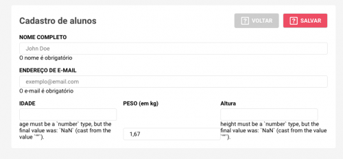
Same row input alignment using Form validation
I am developing a register form in React, and for validation of input's I use Yup.
In the third row of the form I have 3 input ' s, when Yup does the validation and inserts the notification messages they get misaligned, follows image:
Follows the CSS of the Form:
form {
    display: flex;
    flex-direction: column;

    padding: 20px;
    margin-top: 20px;
    border-radius: 4px;
    background: #fff;

    label {
      font-weight: bold;
      margin: 15px 0 5px 0;
      font-size: 14px;
    }

    input {
      height: 30px;
      border-radius: 4px;
      border: 1px solid rgba(0, 0, 0, 0.1);
      padding-left: 15px;
    }

    div {
      display: flex;
      justify-content: space-between;

      div {
        display: flex;
        flex-direction: column;

        input {
          width: 240px;
        }
      }
    }
}
2 answers
In
form div {
      display: flex;
      justify-content: space-between;
Change to
form div {
      display: flex;
      justify-content: flex-start;
The flex-start will align the inner element at the top of the container , the space-between ends up aligning an element at each corner of the container generating this space between the text and the input
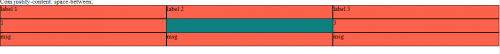
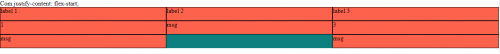
Image code above:
html, body {
  width: 100%;
  height: 100%;
  margin: 0;
  padding: 0;
}

.row {
  display: flex;
  flex-direction: column;
  background-color: teal;
  /* justify-content: space-between; */
  justify-content: flex-start;
  flex-basis: calc(100%/3);
}
.box{
  width: 100%;
  background-color: tomato;
  box-sizing: border-box;
  border: 1px solid #000;
  height: 35px;
}

.container {
  display: flex;
}
Com justify-content: flex-start;
<div class="container">
<div class="row">
<div class="box">label 1</div>
<div class="box">1</div>
<div class="box">msg</div>
</div>
<div class="row">
<div class="box">label 2</div>
<div class="box">msg</div>
</div>
<div class="row">
<div class="box">label 3</div>
<div class="box">3</div>
<div class="box">msg</div>
</div>
</div>The justify-content: space-between; Property positions the two elements at each end of the div (in your case, vertical ends).
By your CSS, you are applying it to the form's direct child divs, which is hereditarily affecting the subdivals of those divs.
Just change these subdivisions by adding justify-content: flex-start; (See the line commented with /* AQUI!! */ in the code below):
form {
    display: flex;
    flex-direction: column;

    padding: 20px;
    margin-top: 20px;
    border-radius: 4px;
    background: #fff;

    label {
      font-weight: bold;
      margin: 15px 0 5px 0;
      font-size: 14px;
    }

    input {
      height: 30px;
      border-radius: 4px;
      border: 1px solid rgba(0, 0, 0, 0.1);
      padding-left: 15px;
    }

    div {
      display: flex;
      justify-content: space-between;

      div {
        display: flex;
        flex-direction: column;
        justify-content: flex-start; /* AQUI!! */

        input {
          width: 240px;
        }
      }
    }
}
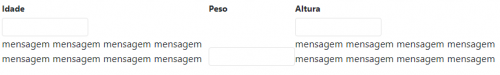
Now notice that when the message is displayed, there is a break in the grid, making a div pull over on the other. To solve this, append
flex: 1;below the property I suggested above. It force the 3 divs to keep the width fixed and equal and do not pull one in others.
See an example:
I changed the width of the inputs to 140px just to illustrate.
form {
    display: flex;
    flex-direction: column;

    padding: 20px;
    margin-top: 20px;
    border-radius: 4px;
    background: #fff;
}

form label {
      font-weight: bold;
      margin: 15px 0 5px 0;
      font-size: 14px;
}

form input {
      height: 30px;
      border-radius: 4px;
      border: 1px solid rgba(0, 0, 0, 0.1);
      padding-left: 15px;
}

form div {
      display: flex;
      justify-content: space-between;
}

form div div {
        display: flex;
        flex-direction: column;
        justify-content: flex-start;
        flex: 1;
}

form div div input {
          width: 140px;
}
<form>
<div>
<div>
<label>Idade</label>
<input type="text">
<div>mensagem mensagem mensagem mensagem mensagem mensagem mensagem mensagem</div>
</div>
<div>
<label>Peso</label>
<input type="text">
</div>
<div>
<label>Altura</label>
<input type="text">
<div>mensagem mensagem mensagem mensagem mensagem mensagem mensagem mensagem</div>
</div>
</div>
</form>See how you do without the suggested properties above:
I recommend you save the complete guide to flexbox, which is very useful for references, queries and asking questions.