Unwanted white space bringing the horizontal scroll bar to life when you zoom out
When resizing the screen, there comes a time that a blank space is being generated in the corner of the screen, so starting to do something with grid and trying to make it responsive, should I add media queries to solve this problem or is it something I should change in the code itself?
Note: I added overflow-x: hidden and the horizontal scroll disappeared but it seemed to me more of a "hack"...
Code replica: https://codepen.io/utamo/pen/KJPNdL
* {
    margin: 0;
    padding: 0;
    font-family: 'Arimo', sans-serif;
}

/* Grid geral */
.grid-container {
    display: grid;
    grid-template-columns: 1fr 3fr 1fr;
    grid-template-rows: 100vh repeat(3,100vh) 10vh;
    grid-template-areas:
        "header header header"
        ". midcontent ."
        ". aftermid . "
        ". finalcontent ."
        "footer footer footer"

}
/* Propriedades header */
.landing-header {
    grid-area: header;
    background: url(https://blog.sakugabooru.com/wp-content/uploads/2017/07/miabyss1.jpg);
  background-size: cover;
    display: flex;
    justify-content: center;
    align-items: center;
    flex-wrap: wrap;
    flex-shrink: 1;

}
.landing-text {
    font-size: 10em;
    color: white;

}
<!DOCTYPE html>
<html lang="en">
<head>
<meta charset="UTF-8">
<link rel="stylesheet" href="css/styles.css">
<link href="https://fonts.googleapis.com/css?family=Arimo" rel="stylesheet">
<title>Document</title>
</head>
<body>
<section class="grid-container">
<header class="landing-header">
<h1 class="landing-text">WaifuLounge</h1>
</header>
</section>
</body>
</html>1 answers
What happens is that vc is using a fixed value in the text, and since that text is not responsive it ends up extrapolating the grid boundaries.
See that putting a word-break: break-all; in the text would already prevent this, but I believe that you do not want the line to break in the middle of the word.
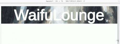
Then another very simple alternative is to put the measure of the text in VW, so it is relative to the width of viewport and will resize itself, without needing to media queries but if you want tb you can do your @media to process the text, even if it is in VW or EM

Follows the code for the second image:
* {
    margin: 0;
    padding: 0;
    font-family: 'Arimo', sans-serif;
}

/* Grid geral */
.grid-container {
    display: grid;
    grid-template-columns: 1fr 3fr 1fr;m
    grid-template-rows: 100vh repeat(3,100vh) 10vh;
    grid-template-areas:
        "header header header"
        ". midcontent ."
        ". aftermid . "
        ". finalcontent ."
        "footer footer footer"

}
/* Propriedades header */
.landing-header {
    grid-area: header;
    background: url('https://blog.sakugabooru.com/wp-content/uploads/2017/07/miabyss1.jpg');
    background-size: cover;
    display: flex;
    justify-content: center;
    align-items: center;
    flex-wrap: wrap;
    flex-shrink: 1;

}
.landing-text {
    /* aqui vc coloca o tamanho do texto relativo a largura da tela */
    font-size: 13vw;
    color: white;
}
<section class="grid-container">
<header class="landing-header">
<h1 class="landing-text">WaifuLounge</h1>
</header>
</section>