User interface planning
I have tried to develop the layout part of some applications, but the only criterion I have always used was to check if it is getting beautiful or not. It turns out that this criterion is not very useful and rarely led me to develop something good.
When developing a user interface for a web application, what are the criteria considered? What are the points I need to raise to be able to make more accurate decisions in the development of a layout ?
2 answers
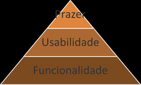
In a very simple and straightforward way, I would say that there are three criteria that would need to be observed:
1. Functionality
If your web application is a commercial or scientific system, it is natural that the most important thing is functionality. That is, the interface should allow the user to use it to achieve one or more practical goals (that is, solve the problem). If it does not serve this purpose, it completely loses all its purpose. Thus, the planning of interface should consider how to offer such services: for example, input fields for the data that are needed, buttons for performing actions, etc.
2. Usability
In addition to the functional character, it is also important that the interface is sufficiently well made so that it is easily "usable" by the user. This involves several aspects (I suggest reading also this other question ) with the intention of making interaction easy, safe and efficient. A experienced designer can imbue your interface planning with good practices, but it is always useful to evaluate this project with real people, representative of the type of user of the intended system, so that problems are perceived as quickly as possible. It is therefore a common practice to carry out tests with low-fidelity prototypes (made on paper, even) to test interaction ideas, metaphors, logical constraints, etc.
3. Experience
Very in addition to usability (which has a pragmatic character about the interaction being easy, succinct, efficient, etc.), there is also the tendency to worry about the "hedonic" character of the interaction. Hedonic means more subjective issues such as appeal, preference, taste, and even fun. In entertainment applications this "requirement" is very obvious, but increasingly it is realized that this is a great need also in commercial and scientific systems, especially when the use is optional (discretionary ) or requires support(it is intended to keep the user's attention for extended periods). In these cases, prototype testing also serves to assess aesthetic preferences, appeal potential, curiosity generated by certain aspects of the interface, and even satisfaction (not in the sense of merely realizing expectations about interface options, but of overcoming them in unique and interesting ways).
Concluding
Planning of an interface in general follows these three criteria, since there is a certain hierarchy of importance between them for a product to be really effective in producing a good user experience, something comparable* to the hierarchy of human needs of Maslow :
*Patrick W. Jordan. Designing Pleasurable Products. Taylor & Francis, 2002
Utilitarian products (such as a hammer, for example) must first of all be functional (be useful for something). Only then attributes such as effectiveness and efficiency become relevant to the user. Finally, less pragmatic attributes (commonly called hedonic or affective), such as appeal, aesthetics, etc., can then become relevant and allow satisfaction to be something beyond the mere absence of discomfort (ergonomics) and for users to create meaning for the product ("my hammer works the same as yours, but it's much cooler").
It turns out that as much as this hierarchy exists, the boundaries between them are rather hazy depending on the type of product intended. Not every product has a primarily utilitarian character, and this also applies to computer systems. Digital games, for example, have no requirements to meet, so the hedonic/affective character becomes more important. This is not to say, however, that usability attributes are not required for this type of product. After all, even if the" problems " in digital games whether intentionally designed to be not easy, players still need to be able to understand the interface and know/remember how to use it effectively and efficiently. In fact, some authors * * indicate that these attributes have their relevance changed according to a utility axis (which indicates whether the application is more "office" or "entertainment"):
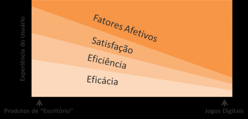
**Bentley, Johnston and Von Baggo. Putting Some Emotion into Requirements Engineering. Proceedings of the 7th Australian Workshop on Requirements Engineering, Deakin University, 2002
In any case, it is part of the "planning" the evaluation of the project concepts, using prototypes of increasing fidelity and with Representative participants of the actual users of the system. Because, only in this way it is possible to validate that the function meets the need and that the interaction is as usable as possible, in addition to gaining valuable indications on the choices of design that most carry affective potential for users.
To learn more about building prototypes, I suggest reading this very nifty material . Also, right here in SOPT there is quite a bit of useful information on the subject in the tags ux and usability.
Nor will I try to add anything to what Luiz Vieira said because he understands much more of the subject than I do. I will only complement an important point for any interface and that for web becomes even more important.
Whenever designing an interface, one must take into account who will use the application. By who also understands what the person will do, how, when, where and why he will use the interface.
And one of the most important specific points is to understand it will be used in different situations (work, for fun, for pleasure, or duty), with the different background of the use of this technology and the web, in a more or less adequate, and especially on devices with different screen sizes differ with the input data (mouse, touch, keyboard, and any physical or virtual), operating systems, various sources are available on different browsers, different versions, and with limited capacity, or the modern and with different settings, including JavaScript disabled.
One of the most common mistakes on the web is to think that everyone will have the conditions that the developer has to use the same interface. It is common not to worry about techniques of graceful degradation or progressive-enhancement.
Another mistake is to think that such a responsive layout is solution to everything. It may be, but often the experience is undermined. Keep this in mind. You have to analyze the cost and benefit of making specific layouts.
It may seem like I'm saying that if it's for web it should work in any situation. And this is another mistake, you can give up some users depending on the cost. Planning is thinking about everything, not solving everything.
And be careful to think that someone has the ability to understand something. How many "developers" came here and could not use the formatting tools even after of some attempts and many gave up. Imagine on the other sites of the network where you may not have developers.
Another important point that causes problems is wanting to be an artist on the interface. I've seen countless times designers want to show how creative they are and make a website become a puzzle to use.
It was already thought of interface standardization in the time of console programming. I could not invent much and people used it well few applications. Even so, a standard was created so that all applications looked alike, that it always worked the same way so as not to have to relearn and adapt in each new application.
With the advent of the GUI and the proliferation of applications beyond the expansion of the user audience a standardization has become even more necessary. Already in the time of the console it was common for programmers to want to be creative, with GUI it could be more and even today we see software that they're freaks. Many developers have no idea of the harm they are causing. They find that doing more beautiful (which is often the opposite of the actual result obtained) makes them better than they are. And worse is that some people end up giving value to it.
Making beautiful is often the same as inventing a notation unknown to users. And on the web everyone wants their website to be special and for this they try to make it more beautiful (nothing wrong with being beautiful) only that in terms of usability it gets special in the wrong way.
Imagine for web where the computer has entered the life of practically everyone and that every website is a new application that the person has to learn to use. Do you want to be creative or do you want to make life easier for those who are accessing? Respect people's time, make them feel comfortable on a page they have never visited before.
If people already make a lot of mistakes in more specific applications they make more mistakes for web that are more comprehensive. Planning an interface is already halfway done. Thinking about the specific points of the web helps walk the rest.
The web is more complex than people imagine, and maybe that's why developers often assume some things mistakenly.
And remember that functionality / content is more important than anything. Of course usability and bad experience can kill a very functional website, but using something empty well is not of the nobody's interest.
So you have to read a lot about it to be able to plan in a minimally adequate way. You need to understand every point, you need to question every decision you're making when you're designing the interface.
In addition to the links that Luiz passed I still advise to follow and ask whenever you have specific questions (obviously doing cross post here :P) in the user experience.
Some HIGs available that help give an idea of what may be needed for your planning: