Why does the iPhone 5 display a width of 320 pixels?
I wrote a simple code:
<!DOCTYPE html>
<html lang="en">
<head>
<meta charset="UTF-8">
<meta id="meta" name="viewport" content="width=device-width">
<style>
*{
margin:0px;
padding:0px;
}
#div{
height:91px;
width:320px;
background-color:red;
display:inline-block;
}
body{
background-color:black;
text-align:center;
}
</style>
</head>
<body>
<div id="div">hello</div>
</body>
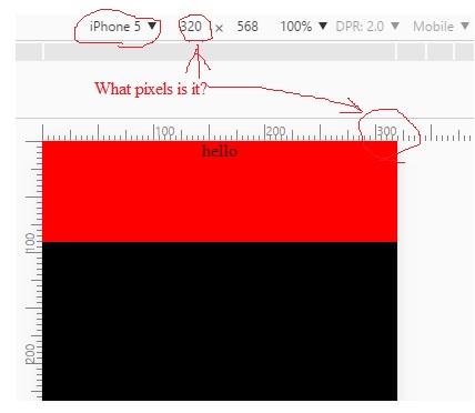
</html> I have a 20-inch monitor, I want to emulate it, as the iPhone displays. To do this, I go to devtools and switch to the phone icon - adaptive layout.
The width of the red square in CSS pixels is 320. I thought that the width of the iPhone 5 buet 640 pixels - "iron" pixels. But it gave only 320 unclear what pixels. What is this number? It turns out that the red square with a width of 320 CSS-pixels is equal to the width of the iPhone 5 with a width of 320 some (SOME - pixels), CSS-pixels or dip-pixels?) pixels . Why is that? I'm used to working on a 20 " monitor, and when I write window. screen.width, then I get 1600 pixels of iron. But, emulating iphon5, I write window. screen.width and I get the same 320 pixels again.
3 answers
There is a concept of a hardware pixel, which has a different size on different devices. and there is the concept of hardware-independent (the one that has the same size on different devices) here's 320 px this last one. and 620 is how many physical pixels a smartphone has in width. read more :
You can also look at this article where it is clearly shown in the illustrations how an image on the physical 640x1136 is obtained from 320x568 points.
In short-initially there is an abstract display with abstract coordinates (points). They are then rendered to pixels on the physical device. These coordinates are multiplied by a multiplier (x1 for iPhone 2G, 3g, 3GS; x2 for iPhone 4, 4s, 5, 5C, 5S, SE, 6, 6S; x3 for iPhone 6/6S Plus. Soon the list will be updated with new models) and it turns out our physical display resolution. In some cases, after multiplication, the image is then reduced.
Please read the answers to your previous questions carefully:
And also my answer to this question:
In particular, in the answers you will see that:
Take an iPad with a retina display. Its actual width in the vertical position is 1536 pixels. But the screen size is the same as the non-retina version. Therefore, for CSS, the device leaves half as many pixels as they actually are - 768 in width.
I highly recommend that you throw out what you are reading and switch to another book or tutorial - because this tutorial has caused confusion in your concepts, and prevents you from developing normally in the layout.