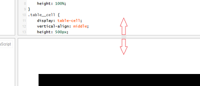
Proportional image resize in width and height
Code, copy to jsfiddle
html,
body {
    height: 100%;
}
.table {
    display: table;
    width: 100%;
    height: 100%;
}
.table__cell {
    display: table-cell;
    vertical-align: middle;
}
img {
    display: block;
    max-width: 100%;
    margin: 0 auto;
}
<div class="table">
<div class="table__cell">
<img src="http://placehold.it/750x350" alt="">
</div>
</div>It uses the standard technique with display:block; and max-width:100% for images:
img {
    display: block;
    max-width: 100%;
}
If you increase / decrease the width of the container, the image decreases/increases its width and at the same time proportionally decreases/increases its height. This is a very cool feature of images, which helps out a lot.
How to do this, to increase / decrease the height of the container, the image behaved like the first case: the height of the image became equal to the height of the container and the width of the image also decreased/increased proportionally? How do I do this without Javascript? (I know how to do it with Javascript.) You can use the most newfangled CSS3 pieces.
2 answers
In general, as it turned out, just one rule and a block container around it are enough to make the image scale in height as well - max-height:100%:
img {
    display: block;
    max-width: 100%;
    max-height: 100%;
}
Here's a ready-made fiddle. (Of course, you need to recycle the zhsfiddlovsky frame (aka container)).
It was found out experimentally that such a solution is possible only inside block elements (for example, body). In elements with display:table and display:table-cell the image is resized only in width, and with display:flex does not resayzitsya at all in any way.
You will have to proportionally resayzit Javascript.
If I understand correctly, then you need to resize the image when resizing the browser window in height.
In this case, using CSS, it will not be possible to do this in the same way as with the width, for the reason that the height does not seem to have a limit, which means that it is not possible to set the height relative to the browser window as a percentage.
In this situation, I still see only one way out - these are media requests (@media). Smooth change you don't have to wait for an image here, although some imitation can still be done:
html,
body {
    height: 100%;
}
.table {
    display: table;
    width: 100%;
    height: 100%;
}
.table__cell {
    display: table-cell;
    vertical-align: middle;
    height: 500px;
    -webkit-transition-duration: 2s;
    -moz-transition-duration: 2s;
    -o-transition-duration: 2s;
    transition-duration: 2s;
}
img {
    display: block;
    max-width: 100%;
    max-height: 100%;
    margin: 0 auto;
}
@media (max-height: 600px) {
    .table__cell {
        -moz-transform:  scale(0.7);
        -ms-transform:  scale(0.7);
        -webkit-transform:  scale(0.7);
        -o-transform:  scale(0.7);
        transform:  scale(0.7);
    }
}
<div class="table">
<div class="table__cell">
<img src="http://www.nn.ru/data/forum/images/2009-12/17931702-putin-obyavil-.jpg" alt="">
</div>
</div>In the example, change the frame.
