Identical sector names in the Google Sheets chart
Let's say I have a table with the columns 'car brand', 'car model', 'quantity'. I build two charts from this data. One shows the relationship between the model and the quantity, the second-between the brand and the quantity.
In the 'car brand' column, the values of the cells can be repeated, so the following table shows me a diagram of 4 sectors with two duplicates of 'Nisan'. How do I make it so that there are three sectors in this diagram and they correspond to the brands?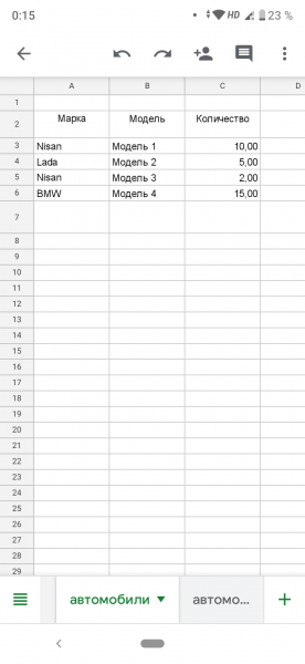
0
Author: Vladislav Badrudin, 2020-02-26
1 answers
Charts do not perform any calculations other than aggregation calculations. Therefore, you need to either prepare the data before plotting, or check the "Aggregate" box in the chart settings.

Or group your data in advance with QUERY
=QUERY(A1:C5,"select A, sum(C) group by A")
And already build a graph on this data.
0
Author: contributorpw, 2020-02-27 10:57:08